


Generative AI for Business Leaders
Advertising with Meta
How Google does Machine Learning


دوراتنا
Real-time data visualization dashboard using Node-red
At the end of this project you are going learn how to create an real-time data visualization dashboard using node-red. so in this project we are going to use openAQ API which is an open source API sharing real-time air quality data related to different cities around the globe. we are going to fetch this data, preprocess it and visualize it using node-red. Therefor, as a very important prerequisite you should have a basic knowledge of node-red. if you don’t have any experience using node-red I recommend to attend my guided project course on introduction to node-red on Coursera.
-
Course by

-
 Self Paced
-
 2 ساعات
-
 الإنجليزية

Communicating Business Analytics Results
The analytical process does not end with models than can predict with accuracy or prescribe the best solution to business problems. Developing these models and gaining insights from data do not necessarily lead to successful implementations. This depends on the ability to communicate results to those who make decisions. Presenting findings to decision makers who are not familiar with the language of analytics presents a challenge.
-
Course by
-
Self Paced
-
7 ساعات
-
الإنجليزية

MATLAB and Octave for Beginners
Learn MATLAB and Octave and start experimenting with matrix manipulations, data visualizations, functions and mathematical computations.
-
Course by

-
44
-
الإنجليزية

Data Visualization and Building Dashboards with Excel and Cognos
Build the fundamental knowledge necessary to use Excel and IBM Cognos Analytics to create data visualizations and to create dashboards containing those visualizations to help tell a lucid story about data.
-
Course by
-
Self Paced
-
28
-
الإنجليزية

MATLAB Essentials
Master the essentials of data visualization, data analysis, programming, and app design interactively with MATLAB.
-
Course by
-
Self Paced
-
6
-
الإنجليزية

Storytelling and Persuading using Data and Digital Technologies
Learn how to gain traction for your digital transformation initiatives with stories based on data that use compelling data visualizations to build a persuasive business case.
-
Course by
-
10
-
الإنجليزية

Stakeholder Outreach: Effective Communication of Complex Environmental Threats
Learn how to engage communities through powerful storytelling, data visualization, and persuasive presence to motivate action on complex environmental projects.
-
Course by
-
10
-
الإنجليزية

Google Sheets - Advanced Topics
This course builds on some of the concepts covered in the earlier Google Sheets course. In this course, you will learn how to apply and customize themes In Google Sheets, and explore conditional formatting options. You will learn about some of Google Sheets’ advanced formulas and functions. You will explore how to create formulas using functions, and you will also learn how to reference and validate your data in a Google Sheet. Spreadsheets can hold millions of numbers, formulas, and text. Making sense of all of that data can be difficult without a summary or visualization.
-
Course by
-
Self Paced
-
3 ساعات
-
الإنجليزية

XG-Boost 101: Used Cars Price Prediction
In this hands-on project, we will train 3 Machine Learning algorithms namely Multiple Linear Regression, Random Forest Regression, and XG-Boost to predict used cars prices. This project can be used by car dealerships to predict used car prices and understand the key factors that contribute to used car prices.
By the end of this project, you will be able to:
- Understand the applications of Artificial Intelligence and Machine Learning techniques in the banking industry
- Understand the theory and intuition behind XG-Boost Algorithm
-
Course by
-
Self Paced
-
3 ساعات
-
الإنجليزية

Empathy, Data, and Risk
Risk Management and Innovation develops your ability to conduct empathy-driven and data-driven analysis in the domain of risk management. This course introduces empathy as a professional competency. It explains the psychological processes that inhibit empathy-building and the processes that determine how organizational stakeholders respond to risk. The course guides you through techniques to gather risk information by understanding a stakeholder’s thoughts, feelings, and goals. These techniques include interviewing, brainstorming, and empathy mapping.
-
Course by
-
Self Paced
-
13 ساعات
-
الإنجليزية
Overview of Data Visualization
In this project, you will develop an understanding and appreciation for data visualization. You will review the benefits of data visualization as you examine existing examples of data that is displayed in a variety of visual formats. In addition, you will gain some hands-on experience in building your own data visualization examples by aggregating data and generating simple charts in Google Sheets. Note: This course works best for learners who are based in the North America region. We’re currently working on providing the same experience in other regions.
-
Course by
-
Self Paced
-
3 ساعات
-
الإنجليزية
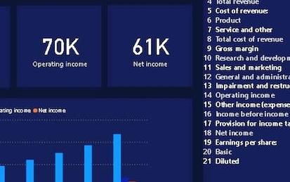
Build an Income Statement Dashboard in Power BI
In this 1.5 hours long project, we will be creating an income statement dashboard filled with relevant charts and data. Power BI dashboards are an amazing way to visualize data and make them interactive. We will begin this guided project by importing the data and transforming it in the Power Query editor. We will then visualize the Income Statement using a table, visualize total revenue, operating income and net income using cards and in the final task visualize the year on year growth using clustered column charts.
-
Course by
-
Self Paced
-
2 ساعات
-
الإنجليزية

Overview of Data Visualization in Microsoft Excel
After finishing this project, you will have learned some basic rules about data visualization and can apply them whenever you create charts. In present times, one can find data visualization in a wide range of fields. Businesses show graphs to report on revenue, police departments create maps of crimes in their jurisdiction, and on the website for the city hall, you can likely find visual comparisons of people who moved to the city and those who left the city. For this reason, it is important for a lot of people to know the basics of data visualization.
-
Course by
-
Self Paced
-
1 ساعات
-
الإنجليزية
Business Intelligence con la Product Suite di Tableau
Questo corso è rivolto a tutti coloro che hanno maturato una conoscenza solida di Tableau. Dopo aver imparato a analizzare dati e costruire visualizzazioni è arrivato il momento di approfondire la conoscenza della Business Intelligence (BI) e andare oltre Tableau. La week 1 è dedicata alle Dashboard e alle Story.
-
Course by
-
Self Paced
-
25 ساعات
-
الإيطالية

Data Science: Visualization
Learn basic data visualization principles and how to apply them using ggplot2.
-
Course by
-
Self Paced
-
12
-
الإنجليزية

Big Data Science with the BD2K-LINCS Data Coordination and Integration Center
The Library of Integrative Network-based Cellular Signatures (LINCS) was an NIH Common Fund program that lasted for 10 years from 2012-2021. The idea behind the LINCS program was to perturb different types of human cells with many different types of perturbations such as drugs and other small molecules, genetic manipulations such as single gene knockdown, knockout, or overexpression, manipulation of the extracellular microenvironment conditions, for example, growing cells on different surfaces, and more.
-
Course by
-
Self Paced
-
9 ساعات
-
الإنجليزية

Data Visualization using Bokeh
Welcome to this 1 hour long guided project on data visualization using Bokeh. In this project you will learn the basics of Bokeh and create different plots and impressive data visualizations in detail. You will also learn Glyphs and how to Map Geo data using Bokeh. Please note that you will need prior programming experience ( beginner level) in Python. You will also need familiarity with Pandas. This is a practical, hands on guided project for learners who already have theoretical understanding of Pandas and Python.
-
Course by
-
Self Paced
-
3 ساعات
-
الإنجليزية

Go Beyond the Numbers: Translate Data into Insights
This is the third of seven courses in the Google Advanced Data Analytics Certificate. In this course, you’ll learn how to find the story within data and tell that story in a compelling way. You'll discover how data professionals use storytelling to better understand their data and communicate key insights to teammates and stakeholders. You'll also practice exploratory data analysis and learn how to create effective data visualizations.
-
Course by
-
Self Paced
-
33 ساعات
-
الإنجليزية
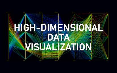
High-dimensional Data visualization techniques using python
By the end of this project you will learn how to analyze high-dimensional data using different visualization techniques. We are going to learn how to implement Scatterplot Matrix and Parallel coordinate plots (PCP) in py…
-
Course by
-
Self Paced
-
2 ساعات
-
الإنجليزية
Data Visualization with R
In this course, you will learn the Grammar of Graphics, a system for describing and building graphs, and how the ggplot2 data visualization package for R applies this concept to basic bar charts, histograms, pie charts, scatter plots, line plots, and box plots. You will also learn how to further customize your charts and plots using themes and other techniques. You will then learn how to use another data visualization package for R called Leaflet to create map plots, a unique way to plot data based on geolocation data.
-
Course by
-
Self Paced
-
12 ساعات
-
الإنجليزية

Python for Data Visualization:Matplotlib & Seaborn(Enhanced)
In this hands-on project, we will understand the fundamentals of data visualization with Python and leverage the power of two important python libraries known as Matplotlib and seaborn. We will learn how to generate line plots, scatterplots, histograms, distribution plot, 3D plots, pie charts, pair plots, countplots and many more! Note: This course works best for learners who are based in the North America region. We’re currently working on providing the same experience in other regions.
-
Course by
-
Self Paced
-
3 ساعات
-
الإنجليزية

Covid-19 Death Medical Analysis & Visualization using Plotly
In this 2-hour long project-based course, you will learn how to build bar graphs, scatter plots, Choropleth maps and Wordcloud to analyze and visualize the global scenario of Covid-19 and perform medical analysis to various conditions that contribute to death due to Covid-19. We will be using two separate datasets for this guided project. The first dataset has been taken from worldometer and the second one has been made available by the Centers for Disease Control and Prevention (CDC), United States. We will be using Python as our Programming language and Google Colab as our notebook.
-
Course by
-
Self Paced
-
3 ساعات
-
الإنجليزية

Advanced Data Visualization with R
Data visualization is a critical skill for anyone that routinely using quantitative data in his or her work - which is to say that data visualization is a tool that almost every worker needs today. One of the critical tools for data visualization today is the R statistical programming language. Especially in conjunction with the tidyverse software packages, R has become an extremely powerful and flexible platform for making figures, tables, and reproducible reports.
-
Course by
-
Self Paced
-
11 ساعات
-
الإنجليزية

Simple Parallel Coordinates Plot using d3 js
Throughout this guided project we are going to create a simple Parallel Coordinates Plot (PCP) using d3 js. PCP is one of the most common data visualization techniques used to visualize high-dimensional datasets. In this guided project you will create a simple PCP step by step. We will also cover some important topics in data visualization such as Linear and Ordinal scaling to best visualize our data. Having the knowledge of javascript programming language and the basics of d3 js are the two most important prerequisites to get the most out of this guided project.
-
Course by
-
Self Paced
-
3 ساعات
-
الإنجليزية

Responsive Website Development and Design
Responsive web design is all about creating the best user experience regardless of whether a user is accessing your site from a desktop computer, a mobile phone, or a tablet. This Specialisation covers the basics of modern full stack web development, from UX design to front-end coding to custom databases. You’ll build foundational skills in a full range of technologies, including HTML/CSS, Javascript, and MongoDB, and you’ll learn to implement a reactive, multi-user web application using the meteor.js framework.
-
Course by
-
Self Paced
-
الإنجليزية