


Generative AI for Business Leaders
Advertising with Meta
How Google does Machine Learning


دوراتنا

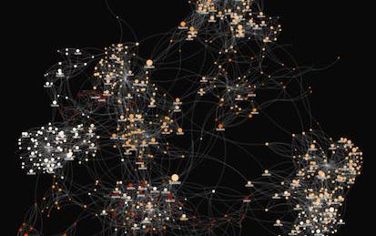
Twitter API: Mining Data using Orange Data Mining Platform
In this one hour long project, you will mine, analyze and visualize various trending tweets using Word Cloud, Heat map, Document Map and perform sentiment analysis using Orange. Orange is an open-source data visualization, machine learning and data mining toolkit. Without any prior programming experience, Orange allows you to mine Twitter. If you are a corporate employee, marketer, or even a student who wants to explore how to mine tweets, Orange is the best platform for it.
-
Course by

-
 Self Paced
-
 3 ساعات
-
 الإنجليزية

Introduction to R Programming and Tidyverse
This course is a gentle introduction to programming in R designed for 3 types of learners. It will be right for you, if: • you want to do data analysis but don’t know programming • you know programming but aren’t familiar with R • you know some R programming but want to learn the tidyverse verbs You will learn to do data visualization and analysis in a reproducible manner and use functions that allow your code to be easily read and understood.
-
Course by
-
Self Paced
-
23 ساعات
-
الإنجليزية

Build Critical Path Visualizations in Tableau and Excel
The Critical Path Method (CPM) is a popular methodology used by project managers and those that manage project schedules. This approach to sequencing and managing projects is highly sought after due to its ability to focus resources and streamline efforts to complete projects where time is of the utmost importance. In this project, learners will learn about the Critical Path Method. They will learn about how to calculate values such as Early Start, Late Start, Early Finish, Late Finish, Float, Duration, and the critical path itself.
-
Course by
-
Self Paced
-
3 ساعات
-
الإنجليزية
Javascript animation for websites, storytelling, data visualization and games
In this course, we’ll guide you through a series of hands-on projects. You’ll build your own animations used in telling stories, in conveying data for presentations and in simple games for motivating kids. Everything will be done using only HTML, CSS and Javascript (ES6), so you’ll gain the foundational skills applicable to any other visualization or game framework you might wish to use later.
Note: discussion forums in guided projects such as this one are not monitored or supported by Coursera staff or instructors.
-
Course by
-
Self Paced
-
2 ساعات
-
الإنجليزية
PowerBI Report Development Crash Course
Hello,
In this project, we will see in detail the steps required to create a PowerBI report using PowerBI Desktop and also we will publish this report on PowerBI service in the respective workspace.
This project is designed for beginners who have no idea about PowerBI so they can quickly get a glimpse of how to create a report in PowerBI.
Pre-requisites:
- PowerBI Account
Here is a brief description of the tasks we are going to perform in this project:
Task1: Get Data
-
Course by
-
Self Paced
-
3 ساعات
-
الإنجليزية

Accounting Data Analytics with Python
This course focuses on developing Python skills for assembling business data. It will cover some of the same material from Introduction to Accounting Data Analytics and Visualization, but in a more general purpose programming environment (Jupyter Notebook for Python), rather than in Excel and the Visual Basic Editor.
-
Course by
-
Self Paced
-
43 ساعات
-
الإنجليزية
Network Analysis in Systems Biology
This course introduces data analysis methods used in systems biology, bioinformatics, and systems pharmacology research. The course covers methods to process raw data from genome-wide mRNA expression studies (microarrays and RNA-seq) including data normalization, clustering, dimensionality reduction, differential expression, enrichment analysis, and network construction. The course contains practical tutorials for using several bioinformatics tools and setting up data analysis pipelines, also covering the mathematics behind the methods applied by these tools and workflows.
-
Course by
-
Self Paced
-
30 ساعات
-
الإنجليزية

Doing more with Google Sheets
Google Sheets is a robust, cloud-based application that empowers you to create sophisticated spreadsheets. Whether you are working at your desk—or from your smartphone or tablet on-the-go—Google Sheets helps you organize, analyze, and share your most important data. In this course for Sheets users, you’ll learn how to make your own supercharged spreadsheets, incorporating powerful functions and visualizations to accelerate your data analysis and share meaningful insights with your team. Follow along with exercises and a companion spreadsheet to practice new skills as you encounter them.
-
Course by
-
Self Paced
-
5 ساعات
-
الإنجليزية

Create Interactive Graphs in Tableau
Tableau is widely recognized as one of the premier data visualization software programs. For many years access to the program was limited to those who purchased licenses. Recently, Tableau launched a public version that grants the ability to create amazing data visualizations for free. Account members can also share and join projects to collaborate on projects that can change the world.
In this project, we will learn how to create an account, create an Interactive Graph in Tableau and share it with others.
-
Course by
-
Self Paced
-
3 ساعات
-
الإنجليزية

Calculate Data in SQL using MySQL Workbench
By the end of this project, you will perform data calculations on product data in a MySQL database using SQL commands.
MySQL is a widely used relational database. Structured Query Language commands are often used in data analysis to provide information vital to business. MySQL workbench provides a User Interface to MySQL data that improves productivity by providing data visualization and an SQL command interface.
Note: This course works best for learners who are based in the North America region. We’re currently working on providing the same experience in other regions.
-
Course by
-
Self Paced
-
3 ساعات
-
الإنجليزية

Data Visualization using Microsoft Excel
Have you ever been asked to create a report based on a lot of data and you did not know where to begin? Or, you simply needed to demonstrate data from different sources all in one place with minimum effort? By the end of this project, you will learn how to operate data to generate a report and demonstrate information in a comprehensive visual way in Microsoft Excel. In this project, you will create a free account on Microsoft 365, you will get access to Microsoft Excel and use data to generate a report with informative charts that you can present to your audience.
-
Course by
-
Self Paced
-
1 ساعات
-
الإنجليزية

Introduction to D3.js
This Guided Project, Introduction to D3.js is for those who want to learn about D3.js which is a JavaScript library for producing SVG-based, dynamic, interactive data visualizations in web browsers. In this 2-hour-long project-based course, you will get to know different SVG elements, build SVG-based webpages using D3.js, Integrate data into the SVG elements, and build simple data visualizations using D3.js. This project is unique because you will learn to build simple SVG-based data representations from scratch using D3.js.
-
Course by
-
Self Paced
-
4 ساعات
-
الإنجليزية

Calculus for Machine Learning and Data Science
Newly updated for 2024! Mathematics for Machine Learning and Data Science is a foundational online program created by DeepLearning.AI and taught by Luis Serrano. In machine learning, you apply math concepts through programming. And so, in this specialization, you’ll apply the math concepts you learn using Python programming in hands-on lab exercises.
-
Course by
-
Self Paced
-
26 ساعات
-
الإنجليزية

AI Workflow: Feature Engineering and Bias Detection
This is the third course in the IBM AI Enterprise Workflow Certification specialization. You are STRONGLY encouraged to complete these courses in order as they are not individual independent courses, but part of a workflow where each course builds on the previous ones. Course 3 introduces you to the next stage of the workflow for our hypothetical media company. In this stage of work you will learn best practices for feature engineering, handling class imbalances and detecting bias in the data. Class imbalances can seriously affect the validity of your
-
Course by
-
Self Paced
-
12 ساعات
-
الإنجليزية
Build an expense tracker app in Django
In this project, you’ll develop a web app for Rumi Press, a book distribution company, that helps the company manage its distribution expenses. You’ll use Python and Django to build data models, scaffold an application using Django Admin, and create visual reports. Upon completion, you’ll publish your project on GitHub and showcase your work with a compelling project overview. There isn’t just one right approach or solution in this scenario, which means you can create a truly unique project that helps you stand out to employers.
-
Course by
-
Self Paced
-
3 ساعات
-
الإنجليزية

How To Create A Sales Forecast In Tableau
In this project, learners will harness the data visualization power of Tableau to create a sales forecast. This will help every sales and marketing professional to guide teams and investments to reach the ultimate goal. Learning how to do this will make presentations more dynamic and prescriptive in nature. Learners will also get a gentle introduction to the Machine Learning principles used to create these forecasts.
This project is designed for sales and marketing leaders who will make consequential decisions based on projections.
-
Course by
-
Self Paced
-
2 ساعات
-
الإنجليزية

Data Analytics in Accounting Capstone
This capstone is the last course in the Data Analytics in Accountancy Specialization. In this capstone course, you are going to take the knowledge and skills you have acquired from the previous courses and apply them to a real-world problem.
-
Course by
-
Self Paced
-
19 ساعات
-
الإنجليزية
Healthcare Information Design and Visualizations
Introduces processes and design principles for creating meaningful displays of information that support effective business decision-making. Studies how to collect and process data; create visualizations (both static and interactive); and use them to provide insight into a problem, situation, or opportunity. Introduces methods to critique visualizations along with ways to answer the elusive question: “What makes a visualization effective?” Discusses the challenges of making data understandable across a wide range of audiences.
-
Course by
-
Self Paced
-
20 ساعات
-
الإنجليزية
Data Visualization in R with ggplot2
Data visualization is a critical skill for anyone that routinely using quantitative data in his or her work - which is to say that data visualization is a tool that almost every worker needs today. One of the critical tools for data visualization today is the R statistical programming language. Especially in conjunction with the tidyverse software packages, R has become an extremely powerful and flexible platform for making figures, tables, and reproducible reports.
-
Course by
-
Self Paced
-
13 ساعات
-
الإنجليزية

Visualizing Data & Communicating Results in R with RStudio
Code and run your first R program in minutes without installing anything! This course is designed for learners with limited coding experience, providing foundational knowledge of data visualizations and R Markdown. The modules in this course cover different types of visualization models such as bar charts, histograms, and heat maps as well as R Markdown.
-
Course by
-
Self Paced
-
10 ساعات
-
الإنجليزية
CASL Programming for Distributed Computing in SAS® Viya®
Welcome to the CASL Programming for Distributed Computing in SAS Viya course. SAS Viya is an AI, analytic and data management platform running on a scalable, distributed, cloud-native architecture. In this course you will learn how how to use the native CAS programming language (CASL) to leverage SAS Cloud Analytics Services (CAS), the high-performance, in-memory analytics and distributed computing engine in SAS Viya .
-
Course by
-
Self Paced
-
الإنجليزية
Dashboarding and Deployment
This course will take you through the various parts of analytical dashboarding: from best practices for designing a dashboard, creating a unified analytical environment, to deploying and publishing visualizations. We will briefly discuss the advanced visualization techniques and you will develop an information layout of the biggest gainers and losers in the financial markets and compare those movements to the economic data as your capstone project.
-
Course by
-
Self Paced
-
9 ساعات
-
الإنجليزية
Looker Data Explorer - Qwik Start
This is a Google Cloud Self-Paced Lab. In this lab, you will create a series of visualizations from the Airports and Flights datasets and save them to a dashboard in Looker.
-
Course by
-
Self Paced
-
1 ساعات
-
الإنجليزية

Foundations of Business Intelligence
This is the first of three courses in the Google Business Intelligence Certificate, which will help develop the skills needed to apply for entry-level roles as a business intelligence (BI) professional. People who work in BI help organizations access the right data, use data to help businesses grow and improve, and put insights into action. In this course, you’ll discover the role of BI professionals within an organization and explore BI tools you can use on the job.
-
Course by
-
Self Paced
-
25 ساعات
-
الإنجليزية
Introduction to Systems and Network Mapping with Kumu
In this 1-hour long project-based course, you will create an interactive multi-elements relationship map, as well as design visualizations for a real-world social network, based on metrics analyses.
Besides helping you to make sense of complex data, relationship maps like the ones we will build here are a great medium to visually present Causal Loop and Stock and Flow diagrams, as well as non-linear dynamics within an ecosystem.
-
Course by
-
Self Paced
-
3 ساعات
-
الإنجليزية