


Generative AI for Business Leaders
Advertising with Meta
How Google does Machine Learning


دوراتنا

Hacking COVID-19: Metabolic Pathway Analysis Yields SARS-CoV-2 Drug Targets
Pathway Bioinformatics is a subfield of Bioinformatics that is concerned with computationally deriving functional insights from genomic data through analysis of molecular networks. This course will present principles and techniques from Pathway Bioinformatics, and will apply these methodologies to the search for drug targets for SARS-CoV-2. The course will begin by discussing motivations for Pathway Bioinformatics, and by presenting an overview of metabolism and of metabolic pathways. Next it will discuss machine representation of pathway data, and methods for pathway visualization.
-
Course by

-
 Self Paced
-
 9 ساعات
-
 الإنجليزية

Data Visualization with R
In this course, you will learn the Grammar of Graphics, a system for describing and building graphs, and how the ggplot2 data visualization package for R applies this concept to basic bar charts, histograms, pie charts, scatter plots, line plots, and box plots. You will also learn how to further customize your charts and plots using themes and other techniques. You will then learn how to use another data visualization package for R called Leaflet to create map plots, a unique way to plot data based on geolocation data.
-
Course by
-
Self Paced
-
12 ساعات
-
الإنجليزية

Optimize Digital Experiences with Service Blueprints in Miro
By the end of this project, you will be able to create a service blueprint that emphasizes digital experiences the customer has with a brand in Miro. Your project will uncover business opportunities by methodically mapping service touchpoints to mitigate risk to improve the customer experience.
To optimize digital experiences with a service blueprint visualization, you will gain hands-on experience applying design thinking, user interface knowledge, and context from each step of the customer experience with the service in the Miro online visual collaboration platform for teamwork.
-
Course by
-
Self Paced
-
2 ساعات
-
الإنجليزية
Go Beyond the Numbers: Translate Data into Insights
This is the third of seven courses in the Google Advanced Data Analytics Certificate. In this course, you’ll learn how to find the story within data and tell that story in a compelling way. You'll discover how data professionals use storytelling to better understand their data and communicate key insights to teammates and stakeholders. You'll also practice exploratory data analysis and learn how to create effective data visualizations.
-
Course by
-
Self Paced
-
33 ساعات
-
الإنجليزية

The Art of Vocal Production
This course addresses recorded vocal performances and the technologies used to highlight and support them in modern record production and mixes. Most of us know that vocals serve as the focal point of modern recordings but many do not know the tools used or when the tools are used best in modern record production. The course begins with simple vocal placement in a mix, where you will also learn the fundamentals of compression and equalization.
-
Course by
-
Self Paced
-
11 ساعات
-
الإنجليزية
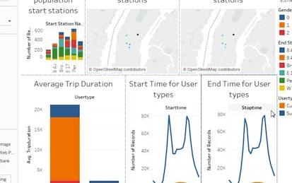
Visualizing Citibike Trips with Tableau
In this 1-hour long project-based course, you will learn the basics of using Tableau Public software to visualize Citibike Trips Dataset. By the end of this project, you will have created a few visualizations and a collection of visualizations called a dashboard.
Note: This course works best for learners who are based in the North America region. We’re currently working on providing the same experience in other regions.
-
Course by
-
Self Paced
-
3 ساعات
-
الإنجليزية

Hierarchical relational data analysis using python
By the end of this project you will learn how to analyze Hierarchical Data. we are going to work with a dataset related to Mexico toy sales. The dataset contains some hierarchical data about different products sold in different stores in different cities in Mexico. we are going to load this data and after some preprocessing steps, we are going to learn how to analyze this data using different visualization techniques. During this project we are going to learn about a very important concept called Data Granularity.
-
Course by
-
Self Paced
-
2 ساعات
-
الإنجليزية

Google Sheets - Advanced Topics
This course builds on some of the concepts covered in the earlier Google Sheets course. In this course, you will learn how to apply and customize themes In Google Sheets, and explore conditional formatting options. You will learn about some of Google Sheets’ advanced formulas and functions. You will explore how to create formulas using functions, and you will also learn how to reference and validate your data in a Google Sheet. Spreadsheets can hold millions of numbers, formulas, and text. Making sense of all of that data can be difficult without a summary or visualization.
-
Course by
-
Self Paced
-
3 ساعات
-
الإنجليزية

Visualization for Statistical Analysis
In this project you will learn about several visualization techniques and their importance for Statistical Analysis. The project demonstrates different plotting techniques, for example, histograms, scatter plots, box and whiskers plot, violin plot, bar plot, addition of regression line to scatter plot, and creating matrix of multiple plots. It also discusses the suitability of each plots according to the data type of the variables and illustrates multiple ways to achieve the desired plots efficiently. The project refers to 'Palmer Penguins' data set for the illustrative purpose.
-
Course by
-
Self Paced
-
3 ساعات
-
الإنجليزية
Overview of Data Visualization
In this project, you will develop an understanding and appreciation for data visualization. You will review the benefits of data visualization as you examine existing examples of data that is displayed in a variety of visual formats. In addition, you will gain some hands-on experience in building your own data visualization examples by aggregating data and generating simple charts in Google Sheets. Note: This course works best for learners who are based in the North America region. We’re currently working on providing the same experience in other regions.
-
Course by
-
Self Paced
-
3 ساعات
-
الإنجليزية

Simple Parallel Coordinates Plot using d3 js
Throughout this guided project we are going to create a simple Parallel Coordinates Plot (PCP) using d3 js. PCP is one of the most common data visualization techniques used to visualize high-dimensional datasets. In this guided project you will create a simple PCP step by step. We will also cover some important topics in data visualization such as Linear and Ordinal scaling to best visualize our data. Having the knowledge of javascript programming language and the basics of d3 js are the two most important prerequisites to get the most out of this guided project.
-
Course by
-
Self Paced
-
3 ساعات
-
الإنجليزية
FIFA20 Data Exploration using Python
By the end of this project, you will learn to use data Exploration techniques in order to uncover some initial patterns, insights and interesting points in your dataset. We are going to use a dataset consisting 5 CSV files, consisting of the data related to players in FIFA video game. We will clean and prepare it by dropping useless columns, calculating new features for our dataset and filling up the null values properly. and then we will start our exploration and we'll do some visualizations.
-
Course by
-
Self Paced
-
2 ساعات
-
الإنجليزية
Empathy, Data, and Risk
Risk Management and Innovation develops your ability to conduct empathy-driven and data-driven analysis in the domain of risk management. This course introduces empathy as a professional competency. It explains the psychological processes that inhibit empathy-building and the processes that determine how organizational stakeholders respond to risk. The course guides you through techniques to gather risk information by understanding a stakeholder’s thoughts, feelings, and goals. These techniques include interviewing, brainstorming, and empathy mapping.
-
Course by
-
Self Paced
-
13 ساعات
-
الإنجليزية

Create an Agile Transformation Roadmap in Miro
By the end of this project, you will be able to create an Agile Transformation Roadmap to transition an organization or a team from current development methods while promoting adoption by maintaining clarity of goals and processes.
To do this, you will gain hands-on experience developing an Agile Transformation Roadmap visualization in the Miro online visual collaboration platform for teamwork.
Note: This course works best for learners who are based in the North America region. We’re currently working on providing the same experience in other regions.
-
Course by
-
Self Paced
-
3 ساعات
-
الإنجليزية

Advanced Data Visualization with R
Data visualization is a critical skill for anyone that routinely using quantitative data in his or her work - which is to say that data visualization is a tool that almost every worker needs today. One of the critical tools for data visualization today is the R statistical programming language. Especially in conjunction with the tidyverse software packages, R has become an extremely powerful and flexible platform for making figures, tables, and reproducible reports.
-
Course by
-
Self Paced
-
11 ساعات
-
الإنجليزية

Data-Driven Decisions with Power BI
New Power BI users will begin the course by gaining a conceptual understanding of the Power BI desktop application and the Power BI service. Learners will explore the Power BI interface while learning how to manage pages and understand the basics of visualizations. Learners can download a course dataset and engage in numerous hands-on experiences to discover how to import, connect, clean, transform, and model their own data in the Power BI desktop application.
-
Course by
-
Self Paced
-
14 ساعات
-
الإنجليزية

Leverage Meeting Productivity Tools in Miro
By the end of this project, you will be able to enhance productivity within remote and hybrid meetings by leveraging productivity tools in Miro.
To do this, you will gain hands-on experience creating visualizations that focus a team on meeting purpose and priorities in the Miro online visual collaboration platform for teamwork.
Note: This course works best for learners who are based in the North America region. We’re currently working on providing the same experience in other regions.
-
Course by
-
Self Paced
-
4 ساعات
-
الإنجليزية
Analyze Data
This course is designed for business professionals that want to learn how to analyze data to gain insight, use statistical analysis methods to explore the underlying distribution of data, use visualizations such as histograms, scatter plots, and maps to analyze data and preprocess data to produce a dataset ready for training. The typical student in this course will have several years of experience with computing technology, including some aptitude in computer programming.
-
Course by
-
Self Paced
-
21 ساعات
-
الإنجليزية

NGO Startup Analysis with Nonprofit Business Model Canvas
By the end of this guided project, you will be able to use the Nonprofit Business Model Canvas to create, deliver, and capture value for your Non-Governmental Organization (NGO). The canvas serves as a blueprint to help you to design, and operationalize your idea in a more systematic approach. The Canvas is 9-block visualization tool derived from the popular Business Model Canvas, but modified to fit into the NGO context.
-
Course by
-
Self Paced
-
4 ساعات
-
الإنجليزية

Covid-19 Death Medical Analysis & Visualization using Plotly
In this 2-hour long project-based course, you will learn how to build bar graphs, scatter plots, Choropleth maps and Wordcloud to analyze and visualize the global scenario of Covid-19 and perform medical analysis to various conditions that contribute to death due to Covid-19. We will be using two separate datasets for this guided project. The first dataset has been taken from worldometer and the second one has been made available by the Centers for Disease Control and Prevention (CDC), United States. We will be using Python as our Programming language and Google Colab as our notebook.
-
Course by
-
Self Paced
-
3 ساعات
-
الإنجليزية

Communicating Business Analytics Results
The analytical process does not end with models than can predict with accuracy or prescribe the best solution to business problems. Developing these models and gaining insights from data do not necessarily lead to successful implementations. This depends on the ability to communicate results to those who make decisions. Presenting findings to decision makers who are not familiar with the language of analytics presents a challenge.
-
Course by
-
Self Paced
-
7 ساعات
-
الإنجليزية

Linear Algebra for Machine Learning and Data Science
Newly updated for 2024! Mathematics for Machine Learning and Data Science is a foundational online program created by DeepLearning.AI and taught by Luis Serrano. In machine learning, you apply math concepts through programming. And so, in this specialization, you’ll apply the math concepts you learn using Python programming in hands-on lab exercises.
-
Course by
-
Self Paced
-
22 ساعات
-
الإنجليزية
Deploy a Modern Web App connected to a Cloud Spanner Instance
This is a self-paced lab that takes place in the Google Cloud console. In this lab you build and deploy a Node.js application connected to a Cloud Spanner instance. The Node.js application is a stock price visualization tool named OmegaTrade. The OmegaTrade application stores stock prices in Cloud Spanner and renders visualizations using Google Charts.
-
Course by
-
Self Paced
-
2 ساعات
-
الإنجليزية
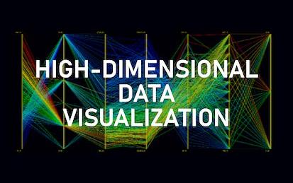
High-dimensional Data visualization techniques using python
By the end of this project you will learn how to analyze high-dimensional data using different visualization techniques. We are going to learn how to implement Scatterplot Matrix and Parallel coordinate plots (PCP) in py…
-
Course by
-
Self Paced
-
2 ساعات
-
الإنجليزية

Python with Power BI: Analyzing Financial Data
In this project, we will create a Financial dashboard for assets like stock and crypto. The dashboard will be dynamic in nature meaning you will be able to get important information and graphs about any stock just by replacing the ticker symbol without ever leaving Power BI. The project begins with you importing real-time financial data from Yahoo Finance using Python libraries. You will harness the power of Python libraries and custom visuals in Power BI to visualize the data, creating approximately 10 different charts and graphs to analyze price and volume movement.
-
Course by
-
Self Paced
-
3 ساعات
-
الإنجليزية