


Generative AI for Business Leaders
Advertising with Meta
How Google does Machine Learning


دوراتنا
COVID19 Data Visualization Using Python
By the end of this project, you will learn How you can use data visualization techniques to answer to some analytical questions. in this project we are going to use COVID19 dataset we have consisting of the data related cumulative number of confirmed, recovered, and deaths cases. we are going to prepare this dataset to answer these questions: How does the Global Spread of the virus look like?, How intensive the spread of the virus has been in the countries? Does covid19 national lockdowns and self-isolations in different countries have actually impact on COVID19 transmission?
-
Course by

-
 Self Paced
-
 2 ساعات
-
 الإنجليزية

Master the Art of Data Visualization With Tableau Public
Tableau is widely recognized as one of the premier data visualization software programs. For many years access to the program was limited to those who purchased licenses. Recently, Tableau launched a public version that grants the ability to create amazing data visualizations for free. Account members can also share and join projects to collaborate on projects that can change the world.
By the end of this project, we will learn how to create an account, create visualizations, and how to share visualizations with others.
-
Course by
-
Self Paced
-
3 ساعات
-
الإنجليزية
Data Visualization using dplyr and ggplot2 in R
Welcome to this project-based course Data Visualization using ggplot2 and dplyr in R. In this project, you will learn how to manipulate data with the dplyr package and create beautiful plots using the ggplot2 package in R. By the end of this 2-hour long project, you will understand how to use different dplyr verbs such as the select verb, filter verb, arrange verb, mutate verb, summarize verb, and the group_by verb to manipulate the gapminder dataset.
-
Course by
-
Self Paced
-
3 ساعات
-
الإنجليزية

Multiple Linear Regression with scikit-learn
In this 2-hour long project-based course, you will build and evaluate multiple linear regression models using Python. You will use scikit-learn to calculate the regression, while using pandas for data management and seaborn for data visualization. The data for this project consists of the very popular Advertising dataset to predict sales revenue based on advertising spending through media such as TV, radio, and newspaper.
By the end of this project, you will be able to:
- Build univariate and multivariate linear regression models using scikit-learn
-
Course by
-
Self Paced
-
3 ساعات
-
الإنجليزية
Data Visualization with Power BI: Storytelling with Data
Data is the new lifeblood of business and visualization has emerged as the common language. Effective communication with data is now a must-have skill for all employees at all levels. In this project, you will build a report to tell data stories to communicate business insights. We will start this hands-on project by preparing the dataset including creating calculated columns to enhance data storytelling. Then, we will create data stories for total sales for different data attributes.
-
Course by
-
Self Paced
-
2 ساعات
-
الإنجليزية

Fundamentals of Data Visualization
Data is everywhere. Charts, graphs, and other types of information visualizations help people to make sense of this data. This course explores the design, development, and evaluation of such information visualizations. By combining aspects of design, computer graphics, HCI, and data science, you will gain hands-on experience with creating visualizations, using exploratory tools, and architecting data narratives.
-
Course by
-
التعلم الذاتي
-
15 ساعات
-
الإنجليزية
Plots Creation using Matplotlib Python
By the end of this project, you will be able to add the data in the CSV file to Pandas data frame, plot the graph, and set marker type and color. You will also be able to apply labels, change font size, add grid lines and legends. Finally, you will be able to create the boxplot and save the graph as an image using the matplotlib and seaborn libraries, which are the most important libraries in python that are used for Data Visualization. You can create bar-plots, scatter-plots, histograms, and a lot more with them. This guided project is for people in the field of data and data analysis.
-
Course by
-
Self Paced
-
3 ساعات
-
الإنجليزية
Geospatial Data Visualization using Python and Folium
In this project, we are going to learn how to process and analyze geospatial data. we are going to work with a dataset containing information about almost 100 taxis running in Proto, Portugal. We are going to learn how to prepare our data and how to use different geospatial visualization techniques in order to answer some analytical questions. during this project, we will learn how to work with the Folium module in python which is one of the best tools when it comes to geospatial data visualization.
-
Course by
-
Self Paced
-
3 ساعات
-
الإنجليزية
Principal Component Analysis with NumPy
Welcome to this 2 hour long project-based course on Principal Component Analysis with NumPy and Python. In this project, you will do all the machine learning without using any of the popular machine learning libraries such as scikit-learn and statsmodels. The aim of this project and is to implement all the machinery of the various learning algorithms yourself, so you have a deeper understanding of the fundamentals.
-
Course by
-
Self Paced
-
3 ساعات
-
الإنجليزية
Visualize Financial Data In Tableau
Tableau is widely recognized as one of the premier data visualization software programs. For many years access to the program was limited to those who purchased licenses. Recently, Tableau launched a public version that grants the ability to create amazing data visualizations for free. Account members can also share and join projects to collaborate on projects that can change the world.
-
Course by
-
Self Paced
-
2 ساعات
-
الإنجليزية
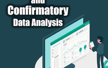
Exploratory vs Confirmatory data analysis using Python
This Guided Project, Exploratory and Confirmatory Data Analysis using python, is for those who want to learn about different methods of data analysis. In this 2-hour-long project-based course, you will understand and apply Exploratory Data Analysis, build different Data visualizations, apply different exploration techniques based on the data at hand and define and understand the concept of Confirmatory Data Analysis. This project is unique because you will learn how and where to start your data exploration.
-
Course by
-
Self Paced
-
2 ساعات
-
الإنجليزية

Assessment for Data Analysis and Visualization Foundations
This course is the final step in the Data Analysis and Visualization Foundations Specialization. It contains a graded final examination that covers content from three courses: Introduction to Data Analytics, Excel Basics for Data Analysis, and Data Visualization and Dashboards with Excel and Cognos. From the Introduction to Data Analytics course, your understanding will be assessed on topics like the data ecosystem and the fundamentals of data analysis, covering tools for data gathering and data mining.
-
Course by
-
Self Paced
-
1 ساعات
-
الإنجليزية
MLOps Platforms: Amazon SageMaker and Azure ML
In MLOps (Machine Learning Operations) Platforms: Amazon SageMaker and Azure ML you will learn the necessary skills to build, train, and deploy machine learning solutions in a production environment using two leading cloud platforms: Amazon Web Services (AWS) and Microsoft Azure.
-
Course by
-
Self Paced
-
13 ساعات
-
الإنجليزية

Data Analysis Using Python
This course provides an introduction to basic data science techniques using Python. Students are introduced to core concepts like Data Frames and joining data, and learn how to use data analysis libraries like pandas, numpy, and matplotlib. This course provides an overview of loading, inspecting, and querying real-world data, and how to answer basic questions about that data. Students will gain skills in data aggregation and summarization, as well as basic data visualization.
-
Course by
-
Self Paced
-
17 ساعات
-
الإنجليزية

Data Visualization Capstone
Data visualization is a critical skill for anyone that routinely using quantitative data in his or her work - which is to say that data visualization is a tool that almost every worker needs today. One of the critical tools for data visualization today is the R statistical programming language. Especially in conjunction with the tidyverse software packages, R has become an extremely powerful and flexible platform for making figures, tables, and reproducible reports.
-
Course by
-
Self Paced
-
22 ساعات
-
الإنجليزية
Create Geovisualizations in Tableau
Tableau is widely recognized as one of the premier data visualization software programs. For many years access to the program was limited to those who purchased licenses. Recently, Tableau launched a public version that grants the ability to create amazing data visualizations for free. Account members can also share and join projects to collaborate on projects that can change the world.
In this project, we will learn how to create an account, how to build simple bar graphs, and how to create a geovisualization.
-
Course by
-
Self Paced
-
3 ساعات
-
الإنجليزية
Empathy and Data in Risk Management
Risk Management and Innovation develops your ability to conduct empathy-driven and data-driven analysis in the domain of risk management. This course focuses on the process of managing enterprise risk, in which understanding both data and stakeholder enriches each step. The course introduces the three lines of defense, tools to identify and assess risks, risk responses, key risk indicators, and risk reporting.
-
Course by
-
Self Paced
-
16 ساعات
-
الإنجليزية
Exploratory Data Analysis with Seaborn
Producing visualizations is an important first step in exploring and analyzing real-world data sets. As such, visualization is an indispensable method in any data scientist's toolbox. It is also a powerful tool to identify problems in analyses and for illustrating results.In this project-based course, we will employ the statistical data visualization library, Seaborn, to discover and explore the relationships in the Breast Cancer Wisconsin (Diagnostic) Data Set.
-
Course by
-
Self Paced
-
3 ساعات
-
الإنجليزية

Classification of COVID19 using Chest X-ray Images in Keras
In this 1 hour long project-based course, you will learn to build and train a convolutional neural network in Keras with TensorFlow as backend from scratch to classify patients as infected with COVID or not using their chest x-ray images. Our goal is to create an image classifier with Tensorflow by implementing a CNN to differentiate between chest x rays images with a COVID 19 infections versus without. The dataset contains the lungs X-ray images of both groups.We will be carrying out the entire project on the Google Colab environment.
-
Course by
-
Self Paced
-
3 ساعات
-
الإنجليزية

Data Analysis with Python Project
The "Data Analysis Project" course empowers students to apply their knowledge and skills gained in this specialization to conduct a real-life data analysis project of their interest. Participants will explore various directions in data analysis, including supervised and unsupervised learning, regression, clustering, dimension reduction, association rules, and outlier detection. Throughout the modules, students will learn essential data analysis techniques and methodologies and embark on a journey from raw data to knowledge and intelligence.
-
Course by
-
Self Paced
-
18 ساعات
-
الإنجليزية
Tools for Exploratory Data Analysis in Business
This course introduces several tools for processing business data to obtain actionable insight. The most important tool is the mind of the data analyst. Accordingly, in this course, you will explore what it means to have an analytic mindset. You will also practice identifying business problems that can be answered using data analytics. You will then be introduced to various software platforms to extract, transform, and load (ETL) data into tools for conducting exploratory data analytics (EDA).
-
Course by
-
Self Paced
-
19 ساعات
-
الإنجليزية

Getting Started with Data Visualization in R
Data visualization is a critical skill for anyone that routinely using quantitative data in his or her work - which is to say that data visualization is a tool that almost every worker needs today. One of the critical tools for data visualization today is the R statistical programming language. Especially in conjunction with the tidyverse software packages, R has become an extremely powerful and flexible platform for making figures, tables, and reproducible reports.
-
Course by
-
Self Paced
-
12 ساعات
-
الإنجليزية

Consulting Presentations and Storytelling
This is the #5 course in the specialization on management consulting. In the previous 4 courses, we’ve learned how consultants break down problems with tools and logical thinking. Now, it’s time to bring all the parts together into consulting-quality presentations and deliverables.
-
Course by
-
Self Paced
-
7 ساعات
-
الإنجليزية

Data Visualization in Microsoft PowerPoint
At the end of this project you will be able to create a simple PowerPoint presentation from scratch using different basic elements. First, you will learn how to create your PowerPoint presentation using text. Then, you will get to know options to improve your presentation by adding images and other visuals. Additionally, you will learn a few easy methods to make your slide transitions smoother and more appealing to your audience. Creating a Microsoft PowerPoint will allow you to be able to have the best visual support possible during your presentation.
-
Course by
-
Self Paced
-
2 ساعات
-
الإنجليزية
Business Intelligence and Visual Analytics
Building on “Data Warehousing and Business Intelligence,” this course focuses on data visualization and visual analytics. Starting with a thorough coverage of what data visualization is and what type of visualization is good for a given purpose, the course quickly dives into development of practical skills and knowledge about visual analytics by way of using one of the most popular visual analytics tools: SAS Viya, a cloud-based analytics platform. An overview of cloud architecture, automation, and machine learning is also provided.
-
Course by
-
Self Paced
-
12 ساعات
-
الإنجليزية