
Advanced Styling with Responsive Design
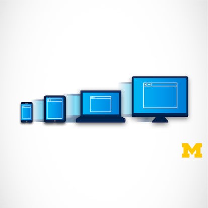
It used to be the case that everyone viewed web pages on about the same size screen - a desktop computer. But now it is just as likely that someone will be using a smart phone, tablet, or assistive technology to access the Internet. Therefore, people viewing your site will now expect that it will perform regardless of the device (smartphone, tablet, laptop, desktop computer, or screen reader) AND take into account some common personal settings such as color schemes.
Buy Now AED 274.99 + VAT
Monthly Subscription Starting at AED 99 + VAT
- Level Foundation
- المدة 12 ساعات hours
- الطبع بواسطة University of Michigan
-
Offered by

عن
It used to be the case that everyone viewed webpages on about the same size screen. But with the explosion of the use of smartphones to access the Internet, the landscape of design has completely changed. People viewing your site will now expect that it will perform regardless of the platform (smartphone, tablet, laptop, or desktop computer). This ability to respond to any platform is called responsive design. This course will expand upon the basic knowledge of CSS3 to include topics such as wireframes, fluid design, media queries, and the use of existing styling paradigms such as Bootstrap. After the course, learners will be able to: ** Explain the mobile-first paradigm and the importance of wireframes in the design phase ** Create sites that behave across a range of platforms ** Utilize existing design frameworks such as Bootstrap This is the fourth course in the Web Design For Everybody specialization. A basic understanding of HTML and CSS is expected when you enroll in this class. Additional courses focus on adding interactivity with the JavaScript Programming Language and completing a capstone project.الوحدات
Lesson 0: Welcome
-
 1
Videos
1
Videos
-
 4
Readings
4
Readings
1
Videos
- Introduction to Responsive Design
4
Readings
- Course Syllabus
- Pre-Course Survey
- Course Resources
- Frequently Asked Questions (FAQ)
Lesson 1: What is Responsive Design?
-
5
Videos
-
4
Readings
-
 2
Discussion
2
Discussion
2
Discussions
- Site Reviews
- Can a file use fluid and absolute measurements together?
5
Videos
- What is Responsive Design?
- Testing Sites
- Benefits of Responsive Design
- Fluid Measurements
- Code With Me: Fluid Measurements
4
Readings
- Week 1 Resources
- Examples of Poor Responsive Design
- What To Do When Your Tool is Deprecated
- Fluid Measurements Background Readings
Lesson 2: Assessment
-
1
Readings
-
1
Discussion
-
 1
Assignment
1
Assignment
 1
Assignment
1
Assignment
- Basic Concepts in Responsive Design Approaches
1
Discussions
- Your Personal Responsive Design Story
1
Readings
- Additional Tools and Resources
Lesson 1: Different Looks at Different Screen Sizes
-
6
Videos
-
1
Readings
-
1
Assignment
1
Assignment
- Practice Quiz -- Challenge Problem
6
Videos
- Media Queries
- Code With Me: Fluid Measurements and Media Queries
- Wire Frames
- Breakpoints
- Media Queries Part Two
- Code With Me: Responsive Navigation
1
Readings
- Week 2 Resources
Lesson 2: Assessment
-
1
Videos
-
2
Readings
-
1
PeerReview
-
 1
ExternalTool
1
ExternalTool
-
1
Assignment
1
Assignment
- Week Two Review: Media Queries and Breakpoints
1
External Tool
- Homework: Optional Gallery Submission
1
Peer Review
- Create a Responsive Stylesheet
1
Videos
- Homework Review: Basic Media Queries
2
Readings
- Homework Description
- Additional Resources
Lesson 1: Using Media Queries
-
5
Videos
-
5
Readings
5
Videos
- Preview of Week 3
- Code With Me: Using Media Queries with Grid
- Code With Me: Using Media Queries with Flex
- Media Queries for Accessibility
- Accessibility Testing
5
Readings
- Week 3 Resources
- Prefers Reduced Motion
- Color Schemes and Color Contrast
- Accessilibity Testing Options
- Additional Resources
Lesson 1: Introduction to Bootstrap
-
5
Videos
-
2
Readings
5
Videos
- Using Frameworks
- Introduction to Bootstrap
- Bootstrap Grid System
- Code With Me: Bootstrap Grid Example
- Code With Me: Bootstrap Navigation Example
2
Readings
- Week 4 Resources
- Getting Started With Bootstrap
Lesson 2: Optional Resources
-
3
Videos
-
1
Readings
3
Videos
- Optional: Interview with M W
- Optional: Interview with H W
- Optional: Interview with H N
1
Readings
- Additional Resources
Lesson 3: Assessment
-
1
Videos
-
1
Readings
-
1
PeerReview
-
1
ExternalTool
-
1
Assignment
1
Assignment
- Responsive Design Final Quiz
1
External Tool
- Final Project: Optional Gallery Submission
1
Peer Review
- Final Project: Photo Gallery
1
Videos
- Homework Review: Final Project
1
Readings
- Final Project Description
Lesson 4: Closing
-
1
Videos
-
1
Readings
1
Videos
- Conclusion
1
Readings
- Post-course Survey
Auto Summary
Enhance your web design skills with "Advanced Styling with Responsive Design." This course, led by Coursera, delves into CSS3, wireframes, fluid design, media queries, and Bootstrap. Ideal for those with basic HTML and CSS knowledge, it spans 720 minutes. Learn to create adaptable sites for any device, supporting diverse user preferences. Available via Starter, Professional, and Paid subscriptions, it's perfect for IT and Computer Science enthusiasts aiming to master responsive design.

Colleen van Lent, Ph.D.

Charles Russell Severance