Buy Now Free
- Level Professional
- المدة 3 ساعات hours
-
Offered by

عن
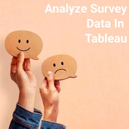
Surveys are used in a variety of scenarios, both in businesses and in research. Companies are using them to better understand consumer insights and feedback, and researchers are going beyond the traditional uses to learn more about the world around us. Tableau can help visualize survey data of all kinds in a useful way—without needing advanced statistics, graphic design, or a statistics background. In this project, learners will learn how to create an account in Tableau and how to manipulate data with joins and pivots. Students will then learn how to create different kinds of visualizations, including tables, pie charts, and a stacked pie chart. This would be a great project for business and academic uses of survey data. This project is designed to be used by those somewhat familiar with Tableau and data visualizations. But the project can be accessible for those new to Tableau as well.Auto Summary
"Analyze Survey Data with Tableau" is an engaging intermediate-level course designed for individuals interested in mastering the art of survey data analysis within the domain of Data Science & AI. Offered by Coursera, this course delves into practical techniques for interpreting survey results, a crucial skill for both business environments and research settings. Guided by expert instructors, learners will explore the powerful capabilities of Tableau, a leading data visualization tool, to transform raw survey data into meaningful insights. Over the span of 180 minutes, participants will gain hands-on experience in visualizing and analyzing survey data, enhancing their ability to make data-driven decisions. The course is accessible for free, making it an excellent opportunity for data enthusiasts, researchers, and professionals seeking to elevate their data analysis proficiency. Whether you're looking to advance your career or refine your data visualization skills, this course is tailored to help you succeed in the competitive field of data science.