
Crash Course on Interactive Data Visualization with Plotly
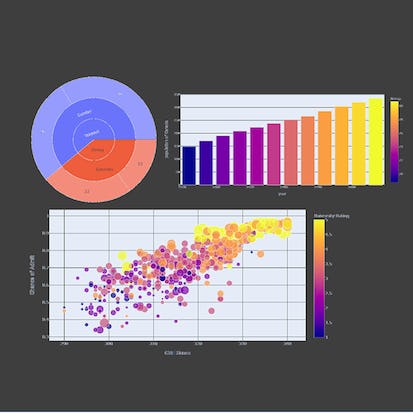
In this hands-on project, we will understand the fundamentals of interactive data visualization using Plolty Express. Plotly Express is a powerful Python package that empowers anyone to create, manipulate and render graphical figures with very few lines of code. Plotly Express is the recommended entry-point into the plotly package. We will leverage Plotly Express to generate interactive single Line plots, multiple line plots, histograms, pie charts, scatterplots, bubble charts, and bar charts. Note: This course works best for learners who are based in the North America region.
Buy Now Free
- Level Foundation
- المدة 3 ساعات hours
- الطبع بواسطة Coursera Project Network
-
Offered by

عن
In this hands-on project, we will understand the fundamentals of interactive data visualization using Plolty Express. Plotly Express is a powerful Python package that empowers anyone to create, manipulate and render graphical figures with very few lines of code. Plotly Express is the recommended entry-point into the plotly package. We will leverage Plotly Express to generate interactive single Line plots, multiple line plots, histograms, pie charts, scatterplots, bubble charts, and bar charts. Note: This course works best for learners who are based in the North America region. We’re currently working on providing the same experience in other regions.الوحدات
Your Learning Journey
-
 1
Readings
1
Readings
-
 1
Plugin
1
Plugin
-
 1
Lab
1
Lab
-
 1
Assignment
1
Assignment
![]() 1
Assignment
1
Assignment
- Assess Your Knowledge
![]() 1
Labs
1
Labs
- Crash Course on Interactive Data Visualization with Plotly
![]() 1
Readings
1
Readings
- Project Overview
Auto Summary
Embark on an enriching learning journey with the "Crash Course on Interactive Data Visualization with Plotly," designed specifically for those diving into Data Science & AI. Guided by the expertise of Coursera, this beginner-level course emphasizes the essentials of interactive data visualization using Plotly Express, a robust Python package that simplifies the creation and manipulation of graphical figures with minimal coding effort. Throughout this 180-minute hands-on project, you'll master the creation of various interactive charts, including single and multiple line plots, histograms, pie charts, scatterplots, bubble charts, and bar charts. This course is especially tailored for learners in the North America region, with efforts underway to extend the same experience globally. Perfect for aspiring data scientists and AI enthusiasts, this free course provides a practical and accessible entry point into the world of interactive data visualization. Join now to unlock the power of Plotly Express and enhance your data storytelling skills.

Ryan Ahmed