Buy Now Free
- Level Professional
- المدة 3 ساعات hours
-
Offered by

عن
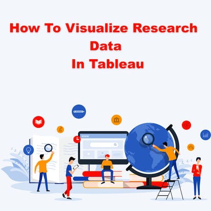
Publishing research often requires the preparation of visual elements like charts, tables, and graphs to better explain the text in a research report. Creating these elements can be done easily and effectively in Tableau. Using Tableau, large and small data sets can be visualized with precision, creativity, interactivity, and options in Tableau. After taking this course learners will know how to create a table, a geovisualization, and a pie chart. Three of the most common research visualizations available. The learners will also learn how to upload data, how to export these tables, and how to incorporate charts and graphs in research reports. Researchers from students to professionals will benefit from learning how to create visualizations based on surveys, observations, experiments, and other types of research methods. Knowledge of research is useful but not required for this project.Auto Summary
Learn to create compelling visual elements for research reports with "How to Visualize Research Data in Tableau." This intermediate-level course from Coursera focuses on enhancing your data visualization skills within the Data Science & AI domain. Over 180 minutes, you'll master techniques to produce insightful charts, tables, and graphs. Enroll for free and elevate your research presentations. Ideal for researchers and data enthusiasts.