


Generative AI for Business Leaders
Advertising with Meta
How Google does Machine Learning


دوراتنا
Create Geovisualizations in Tableau
Tableau is widely recognized as one of the premier data visualization software programs. For many years access to the program was limited to those who purchased licenses. Recently, Tableau launched a public version that grants the ability to create amazing data visualizations for free. Account members can also share and join projects to collaborate on projects that can change the world.
In this project, we will learn how to create an account, how to build simple bar graphs, and how to create a geovisualization.
-
Course by

-
 Self Paced
-
 3 ساعات
-
 الإنجليزية

Empathy and Data in Risk Management
Risk Management and Innovation develops your ability to conduct empathy-driven and data-driven analysis in the domain of risk management. This course focuses on the process of managing enterprise risk, in which understanding both data and stakeholder enriches each step. The course introduces the three lines of defense, tools to identify and assess risks, risk responses, key risk indicators, and risk reporting.
-
Course by
-
Self Paced
-
16 ساعات
-
الإنجليزية
Exploratory Data Analysis with Seaborn
Producing visualizations is an important first step in exploring and analyzing real-world data sets. As such, visualization is an indispensable method in any data scientist's toolbox. It is also a powerful tool to identify problems in analyses and for illustrating results.In this project-based course, we will employ the statistical data visualization library, Seaborn, to discover and explore the relationships in the Breast Cancer Wisconsin (Diagnostic) Data Set.
-
Course by
-
Self Paced
-
3 ساعات
-
الإنجليزية

Classification of COVID19 using Chest X-ray Images in Keras
In this 1 hour long project-based course, you will learn to build and train a convolutional neural network in Keras with TensorFlow as backend from scratch to classify patients as infected with COVID or not using their chest x-ray images. Our goal is to create an image classifier with Tensorflow by implementing a CNN to differentiate between chest x rays images with a COVID 19 infections versus without. The dataset contains the lungs X-ray images of both groups.We will be carrying out the entire project on the Google Colab environment.
-
Course by
-
Self Paced
-
3 ساعات
-
الإنجليزية

Data Analysis with Python Project
The "Data Analysis Project" course empowers students to apply their knowledge and skills gained in this specialization to conduct a real-life data analysis project of their interest. Participants will explore various directions in data analysis, including supervised and unsupervised learning, regression, clustering, dimension reduction, association rules, and outlier detection. Throughout the modules, students will learn essential data analysis techniques and methodologies and embark on a journey from raw data to knowledge and intelligence.
-
Course by
-
Self Paced
-
18 ساعات
-
الإنجليزية

Tools for Exploratory Data Analysis in Business
This course introduces several tools for processing business data to obtain actionable insight. The most important tool is the mind of the data analyst. Accordingly, in this course, you will explore what it means to have an analytic mindset. You will also practice identifying business problems that can be answered using data analytics. You will then be introduced to various software platforms to extract, transform, and load (ETL) data into tools for conducting exploratory data analytics (EDA).
-
Course by
-
Self Paced
-
19 ساعات
-
الإنجليزية

Getting Started with Data Visualization in R
Data visualization is a critical skill for anyone that routinely using quantitative data in his or her work - which is to say that data visualization is a tool that almost every worker needs today. One of the critical tools for data visualization today is the R statistical programming language. Especially in conjunction with the tidyverse software packages, R has become an extremely powerful and flexible platform for making figures, tables, and reproducible reports.
-
Course by
-
Self Paced
-
12 ساعات
-
الإنجليزية

Consulting Presentations and Storytelling
This is the #5 course in the specialization on management consulting. In the previous 4 courses, we’ve learned how consultants break down problems with tools and logical thinking. Now, it’s time to bring all the parts together into consulting-quality presentations and deliverables.
-
Course by
-
Self Paced
-
7 ساعات
-
الإنجليزية
Business Intelligence and Visual Analytics
Building on “Data Warehousing and Business Intelligence,” this course focuses on data visualization and visual analytics. Starting with a thorough coverage of what data visualization is and what type of visualization is good for a given purpose, the course quickly dives into development of practical skills and knowledge about visual analytics by way of using one of the most popular visual analytics tools: SAS Viya, a cloud-based analytics platform. An overview of cloud architecture, automation, and machine learning is also provided.
-
Course by
-
Self Paced
-
12 ساعات
-
الإنجليزية
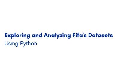
Exploring and Analyzing Fifa's Datasets Using Python
In this 1-hour long project-based course, you will learn how to load a dataset into a pandas dataframe, you will learn how to tidy a messy dataset (Data Tidying), you will get to also visualize the dataset using Matplotlib and seaborn, you will learn how to engineer new features, you will also get to learn how to merge datasets (Data Integration)
-
Course by
-
Self Paced
-
2 ساعات
-
الإنجليزية

AI Workflow: Data Analysis and Hypothesis Testing
This is the second course in the IBM AI Enterprise Workflow Certification specialization. You are STRONGLY encouraged to complete these courses in order as they are not individual independent courses, but part of a workflow where each course builds on the previous ones. In this course you will begin your work for a hypothetical streaming media company by doing exploratory data analysis (EDA). Best practices for data visualization, handling missing data, and hypothesis testing will be introduced to you as part of your work. You will learn techniques of estimation
-
Course by
-
Self Paced
-
11 ساعات
-
الإنجليزية

Analyze Survey Data with Tableau
Surveys are used in a variety of scenarios, both in businesses and in research. Companies are using them to better understand consumer insights and feedback, and researchers are going beyond the traditional uses to learn more about the world around us. Tableau can help visualize survey data of all kinds in a useful way—without needing advanced statistics, graphic design, or a statistics background.
-
Course by
-
Self Paced
-
3 ساعات
-
الإنجليزية
Research Report: Delivering Insights
You have completed all the hard work of conducting your internal, secondary, and primary research. You have analyzed all the data and are able to formulate insights and recommendations based on your research proposal. But what is the best way to present your findings and be able to make a decision? In this course, you will discuss how to incorporate a story in your marketing presentation to help you capture the attention and gain support of stakeholders and business leaders.
-
Course by
-
Self Paced
-
15 ساعات
-
الإنجليزية
Google Advanced Data Analytics Capstone
You’re almost there! This is the seventh and final course of the Google Advanced Data Analytics Certificate. In this course, you have the opportunity to complete an optional capstone project that includes key concepts from each of the six preceding courses.
-
Course by
-
Self Paced
-
10 ساعات
-
الإنجليزية
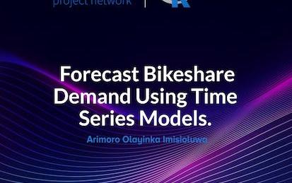
Forecast bikeshare demand using time series models in R
In this project, you’ll help a bike rental company enhance its fleet management and pricing strategy by building a daily bike rental forecasting model using time series analysis techniques in R. Your objectives include loading, cleaning, processing, and analyzing daily rental transaction data, and developing and evaluating time series models for the most accurate predictions. The company will use your validated forecasting model to determine the optimal number of bikes to keep in each station and set dynamic pricing based on predicted demand.
-
Course by
-
Self Paced
-
3 ساعات
-
الإنجليزية
Image Compression with K-Means Clustering
In this project, you will apply the k-means clustering unsupervised learning algorithm using scikit-learn and Python to build an image compression application with interactive controls.
-
Course by
-
Self Paced
-
3 ساعات
-
الإنجليزية
Publishing Visualizations in R with Shiny and flexdashboard
Data visualization is a critical skill for anyone that routinely using quantitative data in his or her work - which is to say that data visualization is a tool that almost every worker needs today. One of the critical tools for data visualization today is the R statistical programming language. Especially in conjunction with the tidyverse software packages, R has become an extremely powerful and flexible platform for making figures, tables, and reproducible reports.
-
Course by
-
Self Paced
-
12 ساعات
-
الإنجليزية

Geospatial Big Data Visualization with Kepler GL
In this 1-hour long project-based course, you will learn how to easily create beautiful data visualization with Kepler and effectively design different geospatial data visualizations.
-
Course by
-
Self Paced
-
3 ساعات
-
الإنجليزية

Twitter API: Mining Data using Orange Data Mining Platform
In this one hour long project, you will mine, analyze and visualize various trending tweets using Word Cloud, Heat map, Document Map and perform sentiment analysis using Orange. Orange is an open-source data visualization, machine learning and data mining toolkit. Without any prior programming experience, Orange allows you to mine Twitter. If you are a corporate employee, marketer, or even a student who wants to explore how to mine tweets, Orange is the best platform for it.
-
Course by
-
Self Paced
-
3 ساعات
-
الإنجليزية
Introduction to R Programming and Tidyverse
This course is a gentle introduction to programming in R designed for 3 types of learners. It will be right for you, if: • you want to do data analysis but don’t know programming • you know programming but aren’t familiar with R • you know some R programming but want to learn the tidyverse verbs You will learn to do data visualization and analysis in a reproducible manner and use functions that allow your code to be easily read and understood.
-
Course by
-
Self Paced
-
23 ساعات
-
الإنجليزية
Javascript animation for websites, storytelling, data visualization and games
In this course, we’ll guide you through a series of hands-on projects. You’ll build your own animations used in telling stories, in conveying data for presentations and in simple games for motivating kids. Everything will be done using only HTML, CSS and Javascript (ES6), so you’ll gain the foundational skills applicable to any other visualization or game framework you might wish to use later.
Note: discussion forums in guided projects such as this one are not monitored or supported by Coursera staff or instructors.
-
Course by
-
Self Paced
-
2 ساعات
-
الإنجليزية
Design and Make Infographics (Project-Centered Course)
In this project-centered course*, you will create a content-rich infographic on a topic of your choice using Adobe Illustrator (which you can download for a free, 30-day trial). You might choose to create a visual representation of data from the world of sports, entertainment, politics, or science, to explain a business trend or environmental issue, or even to present a theme or development from your personal life.
-
Course by
-
Self Paced
-
9 ساعات
-
الإنجليزية

Share Data Through the Art of Visualization
This is the sixth course in the Google Data Analytics Certificate. You’ll learn how to visualize and present your data findings as you complete the data analysis process. This course will show you how data visualizations, such as visual dashboards, can help bring your data to life. You’ll also explore Tableau, a data visualization platform that will help you create effective visualizations for your presentations.
-
Course by
-
Self Paced
-
24 ساعات
-
الإنجليزية

Excel Power Tools for Data Analysis
Welcome to Excel Power Tools for Data Analysis. In this four-week course, we introduce Power Query, Power Pivot and Power BI, three power tools for transforming, analysing and presenting data. Excel's ease and flexibility have long made it a tool of choice for doing data analysis, but it does have some inherent limitations: for one, truly "big" data simply does not fit in a spreadsheet and for another, the process of importing and cleaning data can be a repetitive, time-consuming and error-prone.
-
Course by
-
15 ساعات
-
الإنجليزية
Data Visualization and Dashboards with Excel and Cognos
Learn how to create data visualizations and dashboards using spreadsheets and analytics tools. This course covers some of the first steps for telling a compelling story with your data using various types of charts and graphs. You'll learn the basics of visualizing data with Excel and IBM Cognos Analytics without having to write any code. You'll start by creating simple charts in Excel such as line, pie and bar charts. You will then create more advanced visualizations with Treemaps, Scatter Charts, Histograms, Filled Map Charts, and Sparklines.
-
Course by
-
Self Paced
-
24 ساعات
-
الإنجليزية