


Generative AI for Business Leaders
Advertising with Meta
How Google does Machine Learning


دوراتنا
Interactive Word Embeddings using Word2Vec and Plotly
In this 2 hour long project, you will learn how to preprocess a text dataset comprising recipes. You will learn how to use natural language processing techniques to generate word embeddings for these ingredients, using Word2Vec. These word embeddings can be used for recommendations in an online store based on added items in a basket, or to suggest alternative items as replacements when stock is limited. You will build this recommendation/discovery feature in an interactive and aesthetic visualization tool.
-
Course by

-
 Self Paced
-
 3 ساعات
-
 الإنجليزية
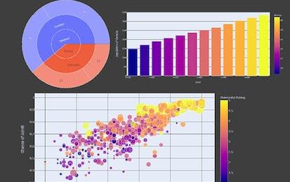
Crash Course on Interactive Data Visualization with Plotly
In this hands-on project, we will understand the fundamentals of interactive data visualization using Plolty Express. Plotly Express is a powerful Python package that empowers anyone to create, manipulate and render graphical figures with very few lines of code. Plotly Express is the recommended entry-point into the plotly package. We will leverage Plotly Express to generate interactive single Line plots, multiple line plots, histograms, pie charts, scatterplots, bubble charts, and bar charts. Note: This course works best for learners who are based in the North America region.
-
Course by
-
Self Paced
-
3 ساعات
-
الإنجليزية

Value Chain Analysis and Visualization in Miro
By the end of this project, you will be able to support cost-effective product development by conducting a value chain analysis.
To create the value chain analysis you will gain hands-on experience defining your business’s primary activities, support for those activities, analyze costs, and discover opportunities to gain a competitive advantage in the Miro online visual collaboration platform for teamwork.
Note: This course works best for learners who are based in the North America region. We’re currently working on providing the same experience in other regions.
-
Course by
-
Self Paced
-
3 ساعات
-
الإنجليزية
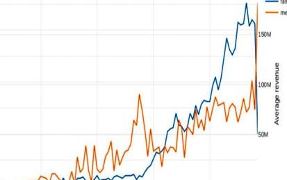
Analyze Box Office Data with Plotly and Python
Welcome to this project-based course on Analyzing Box Office Data with Plotly and Python. In this course, you will be working with the The Movie Database (TMDB) Box Office Prediction data set. The motion picture industry is raking in more revenue than ever with its expansive growth the world over. Can we build models to accurately predict movie revenue? Could the results from these models be used to further increase revenue? We try to answer these questions by way of exploratory data analysis (EDA) and feature engineering. We will primarily use Plotly for data visualization.
-
Course by
-
Self Paced
-
3 ساعات
-
الإنجليزية
AutoML tools for data science
By the end of this project, you will learn how to perform analysis on data using different python libraries and export reports and visualization without much hassle all this with minimal coding.
-
Course by
-
Self Paced
-
3 ساعات
-
الإنجليزية

Python for Everybody
This Specialization builds on the success of the Python for Everybody course and will introduce fundamental programming concepts including data structures, networked application program interfaces, and databases, using the Python programming language. In the Capstone Project, you’ll use the technologies learned throughout the Specialization to design and create your own applications for data retrieval, processing, and visualization.
-
Course by
-
Self Paced
-
الإنجليزية
Excel Skills for Data Analytics and Visualization
As data becomes the modern currency, so the ability to quickly and accurately analyse data has become of paramount importance. Therefore, data analytics and visualization are two of the most sought after skills for high paying jobs with strong future growth prospects. According to an IBM report, the Excel tools for data analytics and visualization are among the top 10 competencies projected to show double-digit growth in their demand.
-
Course by
-
Self Paced
-
الإنجليزية

Database Design and Operational Business Intelligence
The goal of this specialization is to provide a comprehensive and holistic view of business intelligence and its enabling technologies, including relational databases, data warehousing, descriptive statistics, data mining, and visual analytics. Through this series of courses, you will explore relational database design, data manipulation through Extract/Transform/Load (ETL), gaining actionable insight through data analytics, data-based decision support, data visualization, and practical, hands-on experience with real-world business intelligence tools.
-
Course by
-
Self Paced
-
الإنجليزية

Analyze User Experience (UX) Survey Data in Miro
By the end of this project, you will be able to review, categorize, and visually report findings from User Experience research.
To do this, you will gain hands-on experience applying design thinking, pattern recognition, analysis skills, and context from User Experience survey research to create an analysis visualization in the Miro online visual collaboration platform for teamwork.
Note: This course works best for learners who are based in the North America region. We’re currently working on providing the same experience in other regions.
-
Course by
-
Self Paced
-
3 ساعات
-
الإنجليزية
Applied Data Science
This action-packed Specialization is for data science enthusiasts who want to acquire practical skills for real world data problems. If you’re interested in pursuing a career in data science, and already have foundational skills or have completed the Introduction to Data Science Specialization, this program is for you! This 4-course Specialization will give you the tools you need to analyze data and make data driven business decisions leveraging computer science and statistical analysis.
-
Course by
-
Self Paced
-
الإنجليزية

Data Warehousing for Business Intelligence
Evaluate business needs, design a data warehouse, and integrate and visualize data using dashboards and visual analytics. This Specialization covers data architecture skills that are increasingly critical across a broad range of technology fields. You’ll learn the basics of structured data modeling, gain practical SQL coding experience, and develop an in-depth understanding of data warehouse design and data manipulation. You’ll have the opportunity to work with large data sets in a data warehouse environment to create dashboards and Visual Analytics.
-
Course by
-
Self Paced
-
الإنجليزية

User Interface (UI) Design with Wireframes in Miro
By the end of this project, you will be able to apply design principles and customer-centric thinking to design a User Interface (UI) with the goal of improving the User Experience (UX).
To design a User Interface with Wireframe visualization, you will gain hands-on experience applying design thinking, user interface knowledge, and context from each step of the customer journey in the Miro online visual collaboration platform for teamwork.
-
Course by
-
Self Paced
-
3 ساعات
-
الإنجليزية

Data Science and Analysis Tools - from Jupyter to R Markdown
This specialization is intended for people without programming experience who seek an approachable introduction to data science that uses Python and R to describe and visualize data sets. This course will equip learners with foundational knowledge of data analysis suitable for any analyst roles. In these four courses, you will cover everything from data wrangling to data visualization.
-
Course by
-
Self Paced
-
الإنجليزية

How To Create An Interactive Resume On Tableau
In this project, learners will learn how to create an Interactive Resume on Tableau. Interactive Resumes are a unique way of showcasing data visualization tools by using charts and graphs to illustrate skills, experiences, education, and work history. For people in the data and analytics industry, these skills are in high demand. Having this unique resume approach is an opportunity to stand out from the crowd. In this project, learners will create a Free account on Tableau Public. They will also learn how to connect Tableau to their data sets.
-
Course by
-
Self Paced
-
3 ساعات
-
الإنجليزية

Electrodynamics: In-depth Solutions for Maxwell’s Equations
This course is the fourth course in the Electrodynamics series, and is directly proceeded by Electrodynamics: Electric and Magnetic Fields. Previously, we have learned about visualization of fields and solutions which were not time dependent. Here, we will return to Maxwell's Equations and use them to produce wave equations which can be used to analyze complex systems, such as oscillating dipoles.
-
Course by
-
Self Paced
-
الإنجليزية

Data Visualization in Excel: Build an Interactive Dashboard
In this 2-hour long project, you will create an interactive dashboard within Excel. Excel Dashboards are important as they provide a visual representation of metrics and other data points in one place. This visual representation consists of charts and graphs, thereby grabbing the user's attention. Learners will start by exploring basic Excel terminology, using Excel functions to prepare raw data for reporting, and finish by using Pivot Tables to produce dynamic reports.
In order to be successful within this project, learners must have a basic understanding of Excel.
-
Course by
-
Self Paced
-
3 ساعات
-
الإنجليزية

Exploratory Data Analysis for the Public Sector with ggplot
Learn about the core pillars of the public sector and the core functions of public administration through statistical Exploratory Data Analysis (EDA). Learn analytical and technical skills using the R programming language to explore, visualize, and present data, with a focus on equity and the administrative functions of planning and reporting. Technical skills in this course will focus on the ggplot2 library of the tidyverse, and include developing bar, line, and scatter charts, generating trend lines, and understanding histograms, kernel density estimations, violin plots, and ridgeplots.
-
Course by
-
Self Paced
-
18 ساعات
-
الإنجليزية

D3Js Basics
In this 1.5-hour long project-based course I will show you the basic concepts to create data visualizations in D3.js. You will learn how to use SVGs, select, and bind data in order to create a bar chart. We will be visualizing firecracker injuries in 2019. This data is from the U.S. Consumer Product Safety Commission (CPSC) Fireworks Annual Report. Inspired by recent events this summer we are going to visualize firework injuries in the United States. Firework injury data can be found at U.S. Consumer Product Safety Commission (CPSC) .
-
Course by
-
Self Paced
-
2 ساعات
-
الإنجليزية

Data Visualization with Python
In today's data-driven world, the ability to create compelling visualizations and tell impactful stories with data is a crucial skill. This comprehensive course will guide you through the process of visualization using coding tools with Python, spreadsheets, and BI (Business Intelligence) tooling.
-
Course by
-
Self Paced
-
3 ساعات
-
الإنجليزية

Information Visualization: Advanced Techniques
This course aims to introduce learners to advanced visualization techniques beyond the basic charts covered in Information Visualization: Fundamentals. These techniques are organized around data types to cover advance methods for: temporal and spatial data, networks and trees and textual data. In this module we also teach learners how to develop innovative techniques in D3.js.
Learning Goals
-
Course by
-
Self Paced
-
16 ساعات
-
الإنجليزية

Scatter Plot for Data Scientists & Big Data Analysts-Visuals
This project gives you easy access to the invaluable learning techniques used by experts for visualization in statistics. We’ll learn about how to use wolfram language to draw curve in easiest way. We’ll also cover illustration and best practices shown by research to be most effective in helping you master plotting curves.
-
Course by
-
Self Paced
-
3 ساعات
-
الإنجليزية
Real-time data visualization dashboard using Node-red
At the end of this project you are going learn how to create an real-time data visualization dashboard using node-red. so in this project we are going to use openAQ API which is an open source API sharing real-time air quality data related to different cities around the globe. we are going to fetch this data, preprocess it and visualize it using node-red. Therefor, as a very important prerequisite you should have a basic knowledge of node-red. if you don’t have any experience using node-red I recommend to attend my guided project course on introduction to node-red on Coursera.
-
Course by
-
Self Paced
-
2 ساعات
-
الإنجليزية

Data Analysis and Visualization
By the end of this course, learners are provided a high-level overview of data analysis and visualization tools, and are prepared to discuss best practices and develop an ensuing action plan that addresses key discoveries. It begins with common hurdles that obstruct adoption of a data-driven culture before introducing data analysis tools (R software, Minitab, MATLAB, and Python). Deeper examination is spent on statistical process control (SPC), which is a method for studying variation over time.
-
Course by
-
Self Paced
-
11 ساعات
-
الإنجليزية

XG-Boost 101: Used Cars Price Prediction
In this hands-on project, we will train 3 Machine Learning algorithms namely Multiple Linear Regression, Random Forest Regression, and XG-Boost to predict used cars prices. This project can be used by car dealerships to predict used car prices and understand the key factors that contribute to used car prices.
By the end of this project, you will be able to:
- Understand the applications of Artificial Intelligence and Machine Learning techniques in the banking industry
- Understand the theory and intuition behind XG-Boost Algorithm
-
Course by
-
Self Paced
-
3 ساعات
-
الإنجليزية

Data Analysis in R: Predictive Analysis with Regression
Increasingly, predictive analytics is shaping companies' decisions about limited resources. In this project, you will build a regression model to make predictions. We will start this hands-on project by exploring the dataset and creating visualizations for the dataset. By the end of this 2-hour-long project, you will be able to build and interpret the result of a simple linear regression model in R. Also, you will learn how to perform model assessments and check for assumptions using diagnostic plots.
-
Course by
-
Self Paced
-
3 ساعات
-
الإنجليزية