


Generative AI for Business Leaders
Advertising with Meta
How Google does Machine Learning


دوراتنا
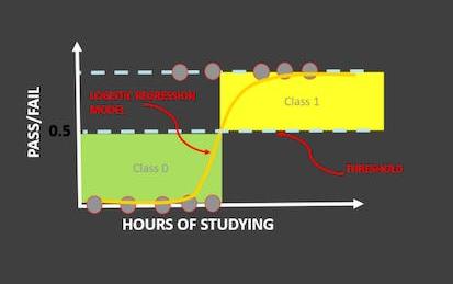
Logistic Regression 101: US Household Income Classification
In this hands-on project, we will train Logistic Regression and XG-Boost models to predict whether a particular person earns less than 50,000 US Dollars or more than 50,000 US Dollars annually. This data was obtained from U.S. Census database and consists of features like occupation, age, native country, capital gain, education, and work class.
By the end of this project, you will be able to:
- Understand the theory and intuition behind Logistic Regression and XG-Boost models
-
Course by

-
 Self Paced
-
 3 ساعات
-
 الإنجليزية

Data Visualization & Storytelling in Python
Hello everyone and welcome to this new hands-on project on data visualization and storytelling in python. In this project, we will leverage 3 powerful libraries known as Seaborn, Matplotlib and Plotly to visualize data in an interactive way. This project is practical and directly applicable to many industries. You can add this project to your portfolio of projects which is essential for your next job interview.
-
Course by
-
Self Paced
-
3 ساعات
-
الإنجليزية

C Programming: Modular Programming and Memory Management - 3
Enhance your coding skills along your path to becoming a proficient C programmer with the essential concepts of functions and pointers. In this course you will be introduced to the concept of modular programming: that is, dividing up more complex tasks into manageable pieces. You will learn how to write your own functions (just like functions in mathematics for example).
-
Course by
-
Self Paced
-
10 ساعات
-
الإنجليزية

Splunk Knowledge Manager 103
In this course, you will go beyond dashboard basics and learn about Dashboard Studio's underlying framework, the dashboard development process from prototyping and wireframing to troubleshooting as well as adding visualizations, dynamic coloring and drilldowns. Then you will go further by making your dashboards interactive with user inputs. You will learn how to use mock data, add annotation searches to a visualization, and improve dashboard performance.
-
Course by
-
Self Paced
-
5 ساعات
-
الإنجليزية
Create a Big Number KPI Dashboard in Tableau Public
Tableau is widely recognized as one of the premier data visualization software programs. For many years access to the program was limited to those who purchased licenses. Recently, Tableau launched a public version that grants the ability to create amazing data visualizations for free. Account members can also share and join projects to collaborate on projects that can change the world.
By the end of this project, you will learn how to create an easy-to-understand communication that will focus attention on specific metrics that guide decisions.
-
Course by
-
Self Paced
-
2 ساعات
-
الإنجليزية
Information Visualization: Programming with D3.js
In this course you will learn how to use D3.js to create powerful visualizations for web. Learning D3.js will enable you to create many different types of visualization and to visualize many different data types. It will give you the freedom to create something as simple as a bar chart as well your own new revolutionary technique.
In this course we will cover the basics of creating visualizations with D3 as well as how to deal with tabular data, geography and networks. By the end of this course you will be able to:
- Create bar and line charts
- Create choropleth and symbol maps
-
Course by
-
Self Paced
-
18 ساعات
-
الإنجليزية

Sales Reporting with HubSpot
In this course, you will use your business data and identify key metrics in order to report on sales with HubSpot’s dashboards. First, you will learn how to operate a data-driven business and how to audit, clean, and organize your data within HubSpot’s CRM. You will then learn to identify the key metrics used to analyze your data on sales and customer service success, within the stages of the Inbound Methodology. This will cover types of testing, using the Sales Hub tools, and reporting in each stage of the methodology.
-
Course by
-
Self Paced
-
الإنجليزية

Visualizing Data in the Tidyverse
Data visualization is a critical part of any data science project. Once data have been imported and wrangled into place, visualizing your data can help you get a handle on what’s going on in the data set. Similarly, once you’ve completed your analysis and are ready to present your findings, data visualizations are a highly effective way to communicate your results to others.
-
Course by
-
Self Paced
-
17 ساعات
-
الإنجليزية

Getting Started with Tidyverse
In this project, you will learn about Tidyverse, a system of packages for data manipulation, exploration and visualization in the R programming language. R is a computer programming language, and it is also an open-source software often used among data scientists, statisticians, and data miners in their everyday work with data sets.
-
Course by
-
Self Paced
-
4 ساعات
-
الإنجليزية

Data Analysis and Visualization with Python
In this course, you will learn how to read and write data from and to a file. You will also examine how to manipulate and analyze the data using lists, tuples, dictionaries, sets, and the pandas and Matplot libraries. As a developer, it's important to understand how to deal with issues that could cause an application to crash. You will learn how to implement exceptions to handle these issues. You do not need a programming or computer science background to learn the material in this course. This course is open to anyone who is interested in learning how to code and write programs in Python.
-
Course by
-
Self Paced
-
16 ساعات
-
الإنجليزية
Deploying Machine Learning Models
In this course we will learn about Recommender Systems (which we will study for the Capstone project), and also look at deployment issues for data products. By the end of this course, you should be able to implement a working recommender system (e.g.
-
Course by
-
Self Paced
-
11 ساعات
-
الإنجليزية
From Excel to Power BI
Are you using Excel to manage, analyze, and visualize your data? Would you like to do more? Perhaps you've considered Power BI as an alternative, but have been intimidated by the idea of working in an advanced environment. The fact is, many of the same tools and mechanisms exist across both these Microsoft products. This means Excel users are actually uniquely positioned to transition to data modeling and visualization in Power BI! Using methods that will feel familiar, you can learn to use Power BI to make data-driven business decisions using large volumes of data.
-
Course by
-
Self Paced
-
3 ساعات
-
الإنجليزية
R Programming and Tidyverse Capstone Project
In this third and final course of the "Expressway to Data Science: R Programming and Tidyverse" specialization you will reinforce and display your R and tidyverse skills by completing an analysis of COVID-19 data! Here is a chance to apply your skills to a real-world dataset that has effected all of us. Throughout the capstone, you will import COVID-19 data; clean, tidy, and join datasets; and develop visualizations. You will also provide some analysis and interpretation to your results, preparing you for your journey into data science.
-
Course by
-
Self Paced
-
10 ساعات
-
الإنجليزية
Getting Started with Data Warehousing and BI Analytics
Kickstart your Data Warehousing and Business Intelligence (BI) Analytics journey with this self-paced course. You will learn how to design, deploy, load, manage, and query data warehouses and data marts. You will also work with BI tools to analyze data in these repositories.
-
Course by
-
Self Paced
-
17 ساعات
-
الإنجليزية

A Simple Scatter Plot using D3 js
During this guided project, you will create a simple scatter plot using D3 js. Starting from loading our dataset we are going to cover some steps in order to create a fully functional scatter plot. We will also cover some important topics in data visualization such as Linear and Ordinal scaling to best visualize our data. Having the knowledge of javascript programming language and the basics of d3 js are the two most important prerequisites to get the most out of this guided project.
-
Course by
-
Self Paced
-
3 ساعات
-
الإنجليزية
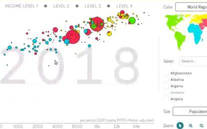
Data Visualization with Plotly Express
Welcome to this project-based course on Data Visualization with Plotly Express. In this project, you will create quick and interactive data visualizations with Plotly Express: a high-level data visualization library in Python inspired by Seaborn and ggplot2. You will explore the various features of the in-built Gapminder dataset, and produce interactive, publication-quality graphs to augment analysis. This course runs on Coursera's hands-on project platform called Rhyme. On Rhyme, you do projects in a hands-on manner in your browser.
-
Course by
-
Self Paced
-
3 ساعات
-
الإنجليزية
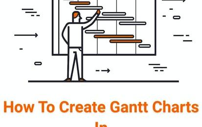
How to Create a Gantt Chart in Tableau
In the world of business managing projects well is essential. Tableau is a powerful data visualization tool that has many applications in a variety of business scenarios. One frequently used tool to visualize time and movement through projects is something called a Gantt Chart. Using Tableau to create a Gantt chart has the added benefit of easy connection with other data sets being collected by this tool. Learning how to take advantage of this powerful business tool to display time-sensitive data is a high-demand skill.
-
Course by
-
Self Paced
-
1 ساعات
-
الإنجليزية

Data-Driven Process Improvement
By the end of this course, learners are empowered to implement data-driven process improvement objectives at their organization. The course covers: the business case for IoT (Internet of Things), the strategic importance of aligning operations and performance goals, best practices for collecting data, and facilitating a process mapping activity to visualize and analyze a process’s flow of materials and information.
-
Course by
-
Self Paced
-
9 ساعات
-
الإنجليزية
COVID19 Data Visualization Using Python
By the end of this project, you will learn How you can use data visualization techniques to answer to some analytical questions. in this project we are going to use COVID19 dataset we have consisting of the data related cumulative number of confirmed, recovered, and deaths cases. we are going to prepare this dataset to answer these questions: How does the Global Spread of the virus look like?, How intensive the spread of the virus has been in the countries? Does covid19 national lockdowns and self-isolations in different countries have actually impact on COVID19 transmission?
-
Course by
-
Self Paced
-
2 ساعات
-
الإنجليزية
Design and Build a Data Warehouse for Business Intelligence Implementation
The capstone course, Design and Build a Data Warehouse for Business Intelligence Implementation, features a real-world case study that integrates your learning across all courses in the specialization.
-
Course by
-
Self Paced
-
45 ساعات
-
الإنجليزية
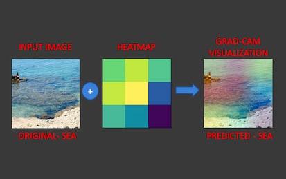
Explainable AI: Scene Classification and GradCam Visualization
In this 2 hour long hands-on project, we will train a deep learning model to predict the type of scenery in images. In addition, we are going to use a technique known as Grad-Cam to help explain how AI models think. This project could be practically used for detecting the type of scenery from the satellite images.
-
Course by
-
Self Paced
-
3 ساعات
-
الإنجليزية
Introduction to Statistics in Python
In this project, learners will get a refresher of introductory statistics, learn about different python libraries that can be used to run statistical analysis, and create visualizations to represent the results. By the end of the project, the learners will import a real world data set, run statistical analysis to find means, medians , standard deviations, correlations, and other information of the data. The learners will also create distinct graphs and plots to represent the data.
-
Course by
-
Self Paced
-
2 ساعات
-
الإنجليزية

Master the Art of Data Visualization With Tableau Public
Tableau is widely recognized as one of the premier data visualization software programs. For many years access to the program was limited to those who purchased licenses. Recently, Tableau launched a public version that grants the ability to create amazing data visualizations for free. Account members can also share and join projects to collaborate on projects that can change the world.
By the end of this project, we will learn how to create an account, create visualizations, and how to share visualizations with others.
-
Course by
-
Self Paced
-
3 ساعات
-
الإنجليزية
Data Visualization using dplyr and ggplot2 in R
Welcome to this project-based course Data Visualization using ggplot2 and dplyr in R. In this project, you will learn how to manipulate data with the dplyr package and create beautiful plots using the ggplot2 package in R. By the end of this 2-hour long project, you will understand how to use different dplyr verbs such as the select verb, filter verb, arrange verb, mutate verb, summarize verb, and the group_by verb to manipulate the gapminder dataset.
-
Course by
-
Self Paced
-
3 ساعات
-
الإنجليزية

Information Visualization: Foundations
The main goal of this specialization is to provide the knowledge and practical skills necessary to develop a strong foundation on information visualization and to design and develop advanced applications for visual data analysis.
-
Course by
-
Self Paced
-
12 ساعات
-
الإنجليزية