


Generative AI for Business Leaders
Advertising with Meta
How Google does Machine Learning


Our Courses

Data-Driven Decisions with Power BI
New Power BI users will begin the course by gaining a conceptual understanding of the Power BI desktop application and the Power BI service. Learners will explore the Power BI interface while learning how to manage pages and understand the basics of visualizations. Learners can download a course dataset and engage in numerous hands-on experiences to discover how to import, connect, clean, transform, and model their own data in the Power BI desktop application.
-
Course by

-
 Self Paced
-
 14 hours
-
 English
Analyze Data
This course is designed for business professionals that want to learn how to analyze data to gain insight, use statistical analysis methods to explore the underlying distribution of data, use visualizations such as histograms, scatter plots, and maps to analyze data and preprocess data to produce a dataset ready for training. The typical student in this course will have several years of experience with computing technology, including some aptitude in computer programming.
-
Course by
-
Self Paced
-
21 hours
-
English

NGO Startup Analysis with Nonprofit Business Model Canvas
By the end of this guided project, you will be able to use the Nonprofit Business Model Canvas to create, deliver, and capture value for your Non-Governmental Organization (NGO). The canvas serves as a blueprint to help you to design, and operationalize your idea in a more systematic approach. The Canvas is 9-block visualization tool derived from the popular Business Model Canvas, but modified to fit into the NGO context.
-
Course by
-
Self Paced
-
4 hours
-
English

Covid-19 Death Medical Analysis & Visualization using Plotly
In this 2-hour long project-based course, you will learn how to build bar graphs, scatter plots, Choropleth maps and Wordcloud to analyze and visualize the global scenario of Covid-19 and perform medical analysis to various conditions that contribute to death due to Covid-19. We will be using two separate datasets for this guided project. The first dataset has been taken from worldometer and the second one has been made available by the Centers for Disease Control and Prevention (CDC), United States. We will be using Python as our Programming language and Google Colab as our notebook.
-
Course by
-
Self Paced
-
3 hours
-
English

Communicating Business Analytics Results
The analytical process does not end with models than can predict with accuracy or prescribe the best solution to business problems. Developing these models and gaining insights from data do not necessarily lead to successful implementations. This depends on the ability to communicate results to those who make decisions. Presenting findings to decision makers who are not familiar with the language of analytics presents a challenge.
-
Course by
-
Self Paced
-
7 hours
-
English

Linear Algebra for Machine Learning and Data Science
Newly updated for 2024! Mathematics for Machine Learning and Data Science is a foundational online program created by DeepLearning.AI and taught by Luis Serrano. In machine learning, you apply math concepts through programming. And so, in this specialization, you’ll apply the math concepts you learn using Python programming in hands-on lab exercises.
-
Course by
-
Self Paced
-
22 hours
-
English

Deploy a Modern Web App connected to a Cloud Spanner Instance
This is a self-paced lab that takes place in the Google Cloud console. In this lab you build and deploy a Node.js application connected to a Cloud Spanner instance. The Node.js application is a stock price visualization tool named OmegaTrade. The OmegaTrade application stores stock prices in Cloud Spanner and renders visualizations using Google Charts.
-
Course by
-
Self Paced
-
2 hours
-
English
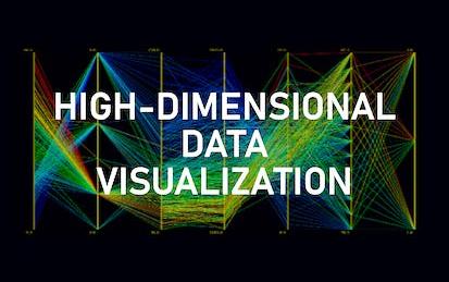
High-dimensional Data visualization techniques using python
By the end of this project you will learn how to analyze high-dimensional data using different visualization techniques.
-
Course by
-
Self Paced
-
2 hours
-
English

Analyzing and Visualizing Data in Looker
In this course, you learn how to do the kind of data exploration and analysis in Looker that would formerly be done primarily by SQL developers or analysts. Upon completion of this course, you will be able to leverage Looker's modern analytics platform to find and explore relevant content in your organization’s Looker instance, ask questions of your data, create new metrics as needed, and build and share visualizations and dashboards to facilitate data-driven decision making.
-
Course by
-
Self Paced
-
5 hours
-
English

Create Digital Marketing Visualizations in Python
Visualizing data is an in-demand skill in many areas of business but particularly in digital marketing.
-
Course by
-
Self Paced
-
4 hours
-
English
Introduction to Data Analytics on Google Cloud
In this beginner-level course, you will learn about the Data Analytics workflow on Google Cloud and the tools you can use to explore, analyze, and visualize data and share your findings with stakeholders. Using a case study along with hands-on labs, lectures, and quizzes/demos, the course will demonstrate how to go from raw datasets to clean data to impactful visualizations and dashboards. Whether you already work with data and want to learn how to be successful on Google Cloud, or you’re looking to progress in your career, this course will help you get started.
-
Course by
-
Self Paced
-
4 hours
-
English

Turn Wireframes into Clickable Prototypes in Miro
By the end of this project, you will be able to apply design principles and customer-centric thinking to turn a wireframe flow visualization into a clickable prototype to accelerate development and achieve high user acceptance.
-
Course by
-
Self Paced
-
3 hours
-
English

Data Visualization using Bokeh
Welcome to this 1 hour long guided project on data visualization using Bokeh. In this project you will learn the basics of Bokeh and create different plots and impressive data visualizations in detail. You will also learn Glyphs and how to Map Geo data using Bokeh. Please note that you will need prior programming experience ( beginner level) in Python. You will also need familiarity with Pandas. This is a practical, hands on guided project for learners who already have theoretical understanding of Pandas and Python.
-
Course by
-
Self Paced
-
3 hours
-
English

R Tutorial
This comprehensive course is your one-stop-shop for learning the R programming language, a popular tool for data analysis, visualization, and statistical computing. Our course covers all the fundamentals of R, including data types, control structures, functions, and packages. Throughout the course, you'll explore how to import, manipulate, and visualize data using R. Plus, you'll learn how to perform statistical analyses and create custom graphics. By the end of this course, you'll have a solid foundation in R programming and be able to use it for a wide range of data analysis tasks.
-
Course by
-
Self Paced
-
12 hours
-
English

Probability & Statistics for Machine Learning & Data Science
Newly updated for 2024! Mathematics for Machine Learning and Data Science is a foundational online program created by DeepLearning.AI and taught by Luis Serrano. In machine learning, you apply math concepts through programming. And so, in this specialization, you’ll apply the math concepts you learn using Python programming in hands-on lab exercises.
-
Course by
-
Self Paced
-
29 hours
-
English

Python for Data Visualization:Matplotlib & Seaborn(Enhanced)
In this hands-on project, we will understand the fundamentals of data visualization with Python and leverage the power of two important python libraries known as Matplotlib and seaborn. We will learn how to generate line plots, scatterplots, histograms, distribution plot, 3D plots, pie charts, pair plots, countplots and many more! Note: This course works best for learners who are based in the North America region. We’re currently working on providing the same experience in other regions.
-
Course by
-
Self Paced
-
3 hours
-
English

Overview of Data Visualization in Microsoft Excel
After finishing this project, you will have learned some basic rules about data visualization and can apply them whenever you create charts.
-
Course by
-
Self Paced
-
1 hour
-
English
Functional Programming in Scala Capstone
In the final capstone project you will apply the skills you learned by building a large data-intensive application using real-world data. You will implement a complete application processing several gigabytes of data.
-
Course by
-
Self Paced
-
32 hours
-
English
Big Data Science with the BD2K-LINCS Data Coordination and Integration Center
The Library of Integrative Network-based Cellular Signatures (LINCS) was an NIH Common Fund program that lasted for 10 years from 2012-2021. The idea behind the LINCS program was to perturb different types of human cells with many different types of perturbations such as drugs and other small molecules, genetic manipulations such as single gene knockdown, knockout, or overexpression, manipulation of the extracellular microenvironment conditions, for example, growing cells on different surfaces, and more.
-
Course by
-
Self Paced
-
9 hours
-
English

Data Visualization for Genome Biology
The past decade has seen a vast increase in the amount of data available to biologists, driven by the dramatic decrease in cost and concomitant rise in throughput of various next-generation sequencing technologies, such that a project unimaginable 10 years ago was recently proposed, the Earth BioGenomes Project, which aims to sequence the genomes of all eukaryotic species on the planet within the next 10 years. So while data are no longer limiting, accessing and interpreting those data has become a bottleneck. One important aspect of interpreting data is data visualization.
-
Course by
-
Self Paced
-
15 hours
-
English
Building Statistical Models in R: Linear Regression
Welcome to this project-based course Building Statistical Models in R: Linear Regression. This is a hands-on project that introduces beginners to the world of statistical modeling. In this project, you will learn the basics of building statistical models in R. We will start this hands-on project by exploring the dataset and creating visualizations for the dataset. By the end of this 2-hour long project, you will understand how to build and interpret the result of simple linear regression models in R.
-
Course by
-
Self Paced
-
3 hours
-
English
Visualizing & Communicating Results in Python with Jupyter
Code and run your first Python program in minutes without installing anything! This course is designed for learners with limited coding experience, providing a foundation for presenting data using visualization tools in Jupyter Notebook. This course helps learners describe and make inferences from data, and better communicate and present data. The modules in this course will cover a wide range of visualizations which allow you to illustrate and compare the composition of the dataset, determine the distribution of the dataset, and visualize complex data such as geographically-based data.
-
Course by
-
Self Paced
-
11 hours
-
English
Create a Business Model Canvas in Miro
By the end of this project, you will be able to align business priorities in a concise visualization.
-
Course by
-
Self Paced
-
3 hours
-
English
Create Beautiful Data Visualizations with Python and Altair
In this Project, we would be creating some visualizations with Altair Python library and you will learn how to manipulate, interact with and save those charts.
-
Course by
-
Self Paced
-
3 hours
-
English
Data Visualization in Power BI: Create Your First Dashboard
Connect Power BI to different sources to create interactive dashboards in Power BI.
-
Course by
-
Self Paced
-
2 hours
-
English