- Level Intermediate
- Duration 3 hours
-
Offered by

About
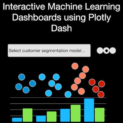
In this 2 hour long project-based course, you will learn how to create an HTML outline of a Plotly Dash dashboard. You will design interactive dropdown lists, radio buttons, and most importantly, scatter plots and bar charts that respond to your mouse's hover. You will learn how to visualize dimensionality reduction results intuitively and interactively, and see how these models can be used in Customer Segmentation. Furthermore, we will discuss how to critically evaluate these models, and what to look out for in a well-performing model. Note: This course works best for learners who are based in the North America region. We're currently working on providing the same experience in other regions.Auto Summary
Unlock the potential of interactive data visualization with the "Interactive Machine Learning Dashboards using Plotly Dash" course. Tailored for data science and AI enthusiasts, this captivating 2-hour project-based course will guide you through the creation of dynamic dashboards using Plotly Dash. Led by Coursera, this intermediate-level course focuses on designing engaging HTML structures featuring interactive dropdown lists, radio buttons, and responsive scatter plots and bar charts. You'll gain hands-on experience in visualizing dimensionality reduction results, crucial for tasks like customer segmentation, and learn to critically evaluate these models to ensure optimal performance. Ideal for learners in North America, this course offers a comprehensive and intuitive approach to mastering interactive dashboards, all at no cost. Whether you're a data science professional looking to enhance your skill set or an AI enthusiast eager to delve into data visualization, this course provides the tools and knowledge you need to succeed.

