Buy Now Free
- Level Beginner
- Duration 3 hours
-
Offered by

About
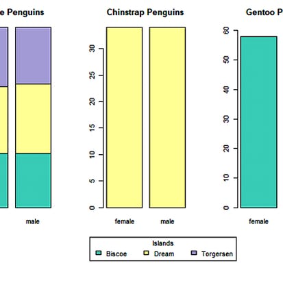
In this project you will learn about several visualization techniques and their importance for Statistical Analysis. The project demonstrates different plotting techniques, for example, histograms, scatter plots, box and whiskers plot, violin plot, bar plot, addition of regression line to scatter plot, and creating matrix of multiple plots. It also discusses the suitability of each plots according to the data type of the variables and illustrates multiple ways to achieve the desired plots efficiently. The project refers to 'Palmer Penguins' data set for the illustrative purpose.Auto Summary
Discover essential visualization techniques for statistical analysis in this beginner-friendly Coursera course. Spanning 180 minutes, it offers free access and is perfect for those diving into Data Science & AI.