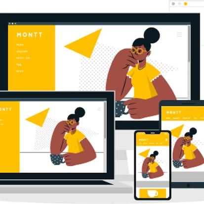
Developing Responsive Web Pages Using HTML5 and CSS3
The number of mobile users has increased exponentially over the past few years. Shopping, social connect, entertainment and other activities are just a few clicks away for these mobile users. A responsive web design adjusts the layout and appearance of the web pages to suit the resolution and width of the screens. This makes a web page look attractive on devices with diverse screen sizes. Designing a well-organized, responsive, and user-friendly web page has therefore become the need of the hour.
Monthly Subscription Starting at AED 99 + VAT
- Level Foundation
- Duration 17 hours
- Course by NIIT
-
Offered by

About
The number of mobile users has increased exponentially over the past few years. Shopping, social connect, entertainment and other activities are just a few clicks away for these mobile users. A responsive web design adjusts the layout and appearance of the web pages to suit the resolution and width of the screens. This makes a web page look attractive on devices with diverse screen sizes. Designing a well-organized, responsive, and user-friendly web page has therefore become the need of the hour. This course will guide you to develop websites that adapt to the device size of the visitor’s viewport and provide users an optimal experience.Modules
Context Setting
-
 1
Videos
1
Videos
1
Videos
- Context Setting
1.1 Normal Document Flow
-
2
Videos
2
Videos
- Normal Document Flow
- Watch and Repeat : Normal Document flow
1.2 Create multiple column layouts using floats and clearfix
-
4
Videos
4
Videos
- Create multiple column layouts using floats and clearfix
- Watch and Repeat : CSS floats
- Watch and Repeat : Clear floats
- Watch and Repeat : CSS float clearfix hack
1.3 Describe the relative and absolute positioning of CSS
-
2
Videos
2
Videos
- Describe the relative and absolute positioning of CSS
- Watch and Repeat : CSS positioning
1.4 Use z-index and stack order to change the rendering order of HTML elements
-
2
Videos
2
Videos
- Use z-index and stack order to change the rendering order of HTML elements
- Watch and Repeat : Z-index and stack order
Practice
-
3
Videos
-
 1
Readings
1
Readings
-
 2
Programming
2
Programming
- Nameplate
- Masonry Layout
3
Videos
- Practice Brief1
- Practice Brief2
- Practice Debrief
1
Readings
- Instructions to upload the Programming Assignment Solution
Challenge
-
2
Videos
-
1
Programming
- Global Sanctuary Fund
2
Videos
- Challenge Brief
- Challenge Debrief
Summary
-
1
Videos
-
1
Readings
-
 1
Assignment
1
Assignment
 1
Assignment
1
Assignment
- Layout a Web page using CSS floats
1
Videos
- Learning Consolidation
1
Readings
- Layout a web page using CSS floats
Context Setting
-
1
Videos
1
Videos
- Context Setting
2.1 Develop responsive web pages using mobile-first approach
-
1
Videos
1
Videos
- Develop responsive web pages using mobile-first approach
2.2 Apply CSS media queries and breakpoints
-
2
Videos
2
Videos
- Apply CSS media queries and breakpoints
- Watch and Repeat : CSS media queries
2.3 Create responsive web design using flexible images
-
2
Videos
2
Videos
- Create responsive web design using flexible images
- Watch and Repeat : Flexible Images
2.4 Apply CSS display properties like flexbox and grid
-
4
Videos
4
Videos
- Apply CSS display properties like flexbox and grid
- Watch and Repeat : Responsive grid system
- Watch and Repeat : Flex container
- Watch and Repeat : Grid layout
2.5 Design a responsive web page using mostly fluid and layout shifter design pattern
-
1
Videos
1
Videos
- Design a responsive web page using mostly fluid and layout shifter design pattern
Practice
-
3
Videos
-
2
Programming
- Mostly Fluid Pattern
- Layout Shifter Pattern Challenge
3
Videos
- Practice Brief1
- Practice Brief2
- Practice Debrief
Challenge
-
2
Videos
-
1
Programming
- PayRoute
2
Videos
- Challenge Brief
- Challenge Debrief
Summary
-
1
Videos
-
1
Readings
-
1
Assignment
1
Assignment
- Develop a responsive web page using modern CSS
1
Videos
- Learning Consolidation
1
Readings
- Develop a responsive web page using modern CSS
Context Setting
-
1
Videos
1
Videos
- Context Setting
3.1 Describe a Bootstrap framework
-
1
Videos
1
Videos
- Describe the Bootstrap framework
3.2 Apply Bootstrap's mobile-first flexbox grid to build layouts
-
2
Videos
2
Videos
- Apply Bootstrap's mobile-first flexbox grid to build layouts
- Watch and Repeat : Bootstrap grid system
3.3 Use various Bootstrap components
-
5
Videos
5
Videos
- Use various Bootstrap components
- Watch and Repeat : Bootstrap tables
- Watch and Repeat : Bootstrap Navbar
- Watch and Repeat : Bootstrap components like button and cards
- Watch and Repeat : Bootstrap components like carousel and forms
3.4 Apply Bootstrap utilities
-
2
Videos
2
Videos
- Apply Bootstrap utilities
- Watch and Repeat : Bootstrap display, spacing and flex utilities
3.5 Design a responsive web page using column drop design pattern
-
1
Videos
1
Videos
- Design a responsive web page using column drop design pattern
Practice
-
2
Videos
-
1
Programming
- Column Drop Pattern
2
Videos
- Practice Brief
- Practice Debrief
Challenge
-
2
Videos
-
1
Programming
- Digix Engineers
2
Videos
- Challenge Brief
- Challenge Debrief
Summary
-
1
Videos
-
1
Readings
-
1
Assignment
1
Assignment
- Develop a responsive web page using Bootstrap
1
Videos
- Learning Consolidation
1
Readings
- Develop a responsive web page using Bootstrap
Auto Summary
Learn to create responsive, user-friendly web pages with HTML5 and CSS3 in this foundational IT & Computer Science course by Coursera. Tailored for the surge in mobile users, it teaches you to design adaptable websites for optimal viewing on any device. Perfect for beginners, the course spans 1020 minutes and offers a starter subscription package. Join now to enhance your web development skills!
NIIT