


Generative AI for Business Leaders
Advertising with Meta
How Google does Machine Learning


دوراتنا

Analyzing and Visualizing Data in Looker
In this course, you learn how to do the kind of data exploration and analysis in Looker that would formerly be done primarily by SQL developers or analysts. Upon completion of this course, you will be able to leverage Looker's modern analytics platform to find and explore relevant content in your organization’s Looker instance, ask questions of your data, create new metrics as needed, and build and share visualizations and dashboards to facilitate data-driven decision making.
-
Course by

-
 Self Paced
-
 5 ساعات
-
 الإنجليزية

Create Digital Marketing Visualizations in Python
Visualizing data is an in-demand skill in many areas of business but particularly in digital marketing. With more and more data available to digital marketers, explaining what to do with it thru well-crafted visualizations shows not only prowess in a data language, but a keen insight into customers and what they are looking for in the products and services we provide. In this project, learners will learn how to create tables, line graphs, bar charts, and scatter plots. We will walk thru each visualization simply and then with a slight uptick.
-
Course by
-
Self Paced
-
4 ساعات
-
الإنجليزية

Introduction to Data Analytics on Google Cloud
In this beginner-level course, you will learn about the Data Analytics workflow on Google Cloud and the tools you can use to explore, analyze, and visualize data and share your findings with stakeholders. Using a case study along with hands-on labs, lectures, and quizzes/demos, the course will demonstrate how to go from raw datasets to clean data to impactful visualizations and dashboards. Whether you already work with data and want to learn how to be successful on Google Cloud, or you’re looking to progress in your career, this course will help you get started.
-
Course by
-
Self Paced
-
4 ساعات
-
الإنجليزية
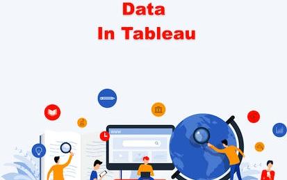
How to Visualize Research Data in Tableau
Publishing research often requires the preparation of visual elements like charts, tables, and graphs to better explain the text in a research report. Creating these elements can be done easily and effectively in Tableau. Using Tableau, large and small data sets can be visualized with precision, creativity, interactivity, and options in Tableau. After taking this course learners will know how to create a table, a geovisualization, and a pie chart. Three of the most common research visualizations available.
-
Course by
-
Self Paced
-
3 ساعات
-
الإنجليزية
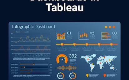
Create Social Media Dashboards in Tableau
Social Media has fundamentally changed how we think about marketing. Brands of all sizes are using social media to not only grow a following but to learn more about what our target audience(s) are interested in. As social media advertising is growing by leaps and bounds, it’s important to understand which ads are working and which ones need some more attention. Learning how to visualize this data can make it easier to make decisions about what to do next.
-
Course by
-
Self Paced
-
2 ساعات
-
الإنجليزية

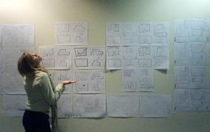
Turn Wireframes into Clickable Prototypes in Miro
By the end of this project, you will be able to apply design principles and customer-centric thinking to turn a wireframe flow visualization into a clickable prototype to accelerate development and achieve high user acceptance.
To do this, you will gain hands-on experience applying design thinking, user interface knowledge, and context from each step of the customer journey while leveraging integrations in the Miro online visual collaboration platform for teamwork.
-
Course by
-
Self Paced
-
3 ساعات
-
الإنجليزية

Data Visualization using Bokeh
Welcome to this 1 hour long guided project on data visualization using Bokeh. In this project you will learn the basics of Bokeh and create different plots and impressive data visualizations in detail. You will also learn Glyphs and how to Map Geo data using Bokeh. Please note that you will need prior programming experience ( beginner level) in Python. You will also need familiarity with Pandas. This is a practical, hands on guided project for learners who already have theoretical understanding of Pandas and Python.
-
Course by
-
Self Paced
-
3 ساعات
-
الإنجليزية

R Tutorial
This comprehensive course is your one-stop-shop for learning the R programming language, a popular tool for data analysis, visualization, and statistical computing. Our course covers all the fundamentals of R, including data types, control structures, functions, and packages. Throughout the course, you'll explore how to import, manipulate, and visualize data using R. Plus, you'll learn how to perform statistical analyses and create custom graphics. By the end of this course, you'll have a solid foundation in R programming and be able to use it for a wide range of data analysis tasks.
-
Course by
-
Self Paced
-
12 ساعات
-
الإنجليزية

Probability & Statistics for Machine Learning & Data Science
Newly updated for 2024! Mathematics for Machine Learning and Data Science is a foundational online program created by DeepLearning.AI and taught by Luis Serrano. In machine learning, you apply math concepts through programming. And so, in this specialization, you’ll apply the math concepts you learn using Python programming in hands-on lab exercises.
-
Course by
-
Self Paced
-
29 ساعات
-
الإنجليزية

Regression Analysis with Yellowbrick
Welcome to this project-based course on Regression Analysis with Yellowbrick. In this project, we will build a machine learning model to predict the compressive strength of high performance concrete (HPC). Although, we will use linear regression, the emphasis of this project will be on using visualization techniques to steer our machine learning workflow. Visualization plays a crucial role throughout the analytical process. It is indispensable for any effective analysis, model selection, and evaluation. This project will make use of a diagnostic platform called Yellowbrick.
-
Course by
-
Self Paced
-
3 ساعات
-
الإنجليزية

Python for Data Visualization:Matplotlib & Seaborn(Enhanced)
In this hands-on project, we will understand the fundamentals of data visualization with Python and leverage the power of two important python libraries known as Matplotlib and seaborn. We will learn how to generate line plots, scatterplots, histograms, distribution plot, 3D plots, pie charts, pair plots, countplots and many more! Note: This course works best for learners who are based in the North America region. We’re currently working on providing the same experience in other regions.
-
Course by
-
Self Paced
-
3 ساعات
-
الإنجليزية
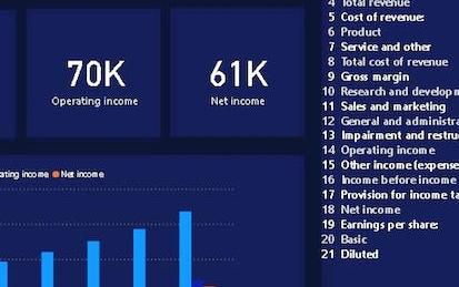
Build an Income Statement Dashboard in Power BI
In this 1.5 hours long project, we will be creating an income statement dashboard filled with relevant charts and data. Power BI dashboards are an amazing way to visualize data and make them interactive. We will begin this guided project by importing the data and transforming it in the Power Query editor. We will then visualize the Income Statement using a table, visualize total revenue, operating income and net income using cards and in the final task visualize the year on year growth using clustered column charts.
-
Course by
-
Self Paced
-
2 ساعات
-
الإنجليزية

Overview of Data Visualization in Microsoft Excel
After finishing this project, you will have learned some basic rules about data visualization and can apply them whenever you create charts. In present times, one can find data visualization in a wide range of fields. Businesses show graphs to report on revenue, police departments create maps of crimes in their jurisdiction, and on the website for the city hall, you can likely find visual comparisons of people who moved to the city and those who left the city. For this reason, it is important for a lot of people to know the basics of data visualization.
-
Course by
-
Self Paced
-
1 ساعات
-
الإنجليزية
Functional Programming in Scala Capstone
In the final capstone project you will apply the skills you learned by building a large data-intensive application using real-world data. You will implement a complete application processing several gigabytes of data.
-
Course by
-
Self Paced
-
32 ساعات
-
الإنجليزية
Big Data Science with the BD2K-LINCS Data Coordination and Integration Center
The Library of Integrative Network-based Cellular Signatures (LINCS) was an NIH Common Fund program that lasted for 10 years from 2012-2021. The idea behind the LINCS program was to perturb different types of human cells with many different types of perturbations such as drugs and other small molecules, genetic manipulations such as single gene knockdown, knockout, or overexpression, manipulation of the extracellular microenvironment conditions, for example, growing cells on different surfaces, and more.
-
Course by
-
Self Paced
-
9 ساعات
-
الإنجليزية

Data Visualization for Genome Biology
The past decade has seen a vast increase in the amount of data available to biologists, driven by the dramatic decrease in cost and concomitant rise in throughput of various next-generation sequencing technologies, such that a project unimaginable 10 years ago was recently proposed, the Earth BioGenomes Project, which aims to sequence the genomes of all eukaryotic species on the planet within the next 10 years. So while data are no longer limiting, accessing and interpreting those data has become a bottleneck. One important aspect of interpreting data is data visualization.
-
Course by
-
Self Paced
-
15 ساعات
-
الإنجليزية
Building Statistical Models in R: Linear Regression
Welcome to this project-based course Building Statistical Models in R: Linear Regression. This is a hands-on project that introduces beginners to the world of statistical modeling. In this project, you will learn the basics of building statistical models in R. We will start this hands-on project by exploring the dataset and creating visualizations for the dataset. By the end of this 2-hour long project, you will understand how to build and interpret the result of simple linear regression models in R.
-
Course by
-
Self Paced
-
3 ساعات
-
الإنجليزية
Visualizing & Communicating Results in Python with Jupyter
Code and run your first Python program in minutes without installing anything! This course is designed for learners with limited coding experience, providing a foundation for presenting data using visualization tools in Jupyter Notebook. This course helps learners describe and make inferences from data, and better communicate and present data. The modules in this course will cover a wide range of visualizations which allow you to illustrate and compare the composition of the dataset, determine the distribution of the dataset, and visualize complex data such as geographically-based data.
-
Course by
-
Self Paced
-
11 ساعات
-
الإنجليزية
Create a Business Model Canvas in Miro
By the end of this project, you will be able to align business priorities in a concise visualization.
To do this, you will gain hands-on experience creating a business model canvas in the Miro online visual collaboration platform for teamwork.
Note: This course works best for learners who are based in the North America region. We’re currently working on providing the same experience in other regions.
-
Course by
-
Self Paced
-
3 ساعات
-
الإنجليزية
Create Beautiful Data Visualizations with Python and Altair
In this Project, we would be creating some visualizations with Altair Python library and you will learn how to manipulate, interact with and save those charts.
-
Course by
-
Self Paced
-
3 ساعات
-
الإنجليزية
Data Visualization in Power BI: Create Your First Dashboard
Connect Power BI to different sources to create interactive dashboards in Power BI. For example, a data analyst can build a dashboard that is interactive and can track key business metrics to help business stakeholders make actionable business decisions.
-
Course by
-
Self Paced
-
2 ساعات
-
الإنجليزية
Create a Custom Marketing Analytics Dashboard in Data Studio
Google Data Studio is a powerful tool that turns data into reports that easy decision-making tools that lead to better business outcomes. Google Data Studio is easy to use, free and works seamlessly with dozens of applications within and outside of the Google Marketing Suite. You can use Google Studio to connect and integrate data from 100’s of applications including Facebook, Constant Contact, Google Ads, and more.
-
Course by
-
Self Paced
-
2 ساعات
-
الإنجليزية
Data Storytelling
This course will cover the more complex concepts that become involved when working beyond simple datasets. Exploring the connection between visual aspects and data understanding, we will examine how those concepts work together through data storytelling. After reviewing key points on how to avoid problematic visualizations and data misrepresentation, you will continue working in Tableau performing multivariate descriptive analysis of the S&P 500 stock sectors.
-
Course by
-
Self Paced
-
9 ساعات
-
الإنجليزية
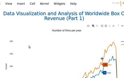
Analyze Box Office Data with Seaborn and Python
Welcome to this project-based course on Analyzing Box Office Data with Seaborn and Python. In this course, you will be working with the The Movie Database (TMDB) Box Office Prediction data set. The motion picture industry is raking in more revenue than ever with its expansive growth the world over. Can we build models to accurately predict movie revenue? Could the results from these models be used to further increase revenue? We try to answer these questions by way of exploratory data analysis (EDA) in this project and the next.
-
Course by
-
Self Paced
-
3 ساعات
-
الإنجليزية

Bank Loan Approval Prediction With Artificial Neural Nets
In this hands-on project, we will build and train a simple deep neural network model to predict the approval of personal loan for a person based on features like age, experience, income, locations, family, education, exiting mortgage, credit card etc.
By the end of this project, you will be able to:
- Understand the applications of Artificial Intelligence and Machine Learning techniques in the banking industry
- Understand the theory and intuition behind Deep Neural Networks
- Import key Python libraries, dataset, and perform Exploratory Data Analysis.
-
Course by
-
Self Paced
-
3 ساعات
-
الإنجليزية