


Generative AI for Business Leaders
Advertising with Meta
How Google does Machine Learning


Our Courses

Sales Reporting with HubSpot
In this course, you will use your business data and identify key metrics in order to report on sales with HubSpot’s dashboards. First, you will learn how to operate a data-driven business and how to audit, clean, and organize your data within HubSpot’s CRM. You will then learn to identify the key metrics used to analyze your data on sales and customer service success, within the stages of the Inbound Methodology. This will cover types of testing, using the Sales Hub tools, and reporting in each stage of the methodology.
-
Course by

-
 Self Paced
-
 English
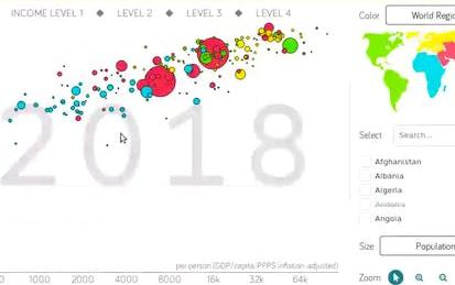
Data Visualization with Plotly Express
Welcome to this project-based course on Data Visualization with Plotly Express. In this project, you will create quick and interactive data visualizations with Plotly Express: a high-level data visualization library in Python inspired by Seaborn and ggplot2. You will explore the various features of the in-built Gapminder dataset, and produce interactive, publication-quality graphs to augment analysis. This course runs on Coursera's hands-on project platform called Rhyme. On Rhyme, you do projects in a hands-on manner in your browser.
-
Course by
-
Self Paced
-
 3 hours
-
English

Stakeholder Outreach: Effective Communication of Complex Environmental Threats
Learn how to engage communities through powerful storytelling, data visualization, and persuasive presence to motivate action on complex environmental projects.
-
Course by

-
Self Paced
-
10
-
English

Storytelling and Persuading using Data and Digital Technologies
Learn how to gain traction for your digital transformation initiatives with stories based on data that use compelling data visualizations to build a persuasive business case.
-
Course by
-
Self Paced
-
10
-
English

MATLAB Essentials
Master the essentials of data visualization, data analysis, programming, and app design interactively with MATLAB.
-
Course by
-
6
-
English

Data Visualization and Building Dashboards with Excel and Cognos
Build the fundamental knowledge necessary to use Excel and IBM Cognos Analytics to create data visualizations and to create dashboards containing those visualizations to help tell a lucid story about data.
-
Course by
-
28
-
English

MATLAB and Octave for Beginners
Learn MATLAB and Octave and start experimenting with matrix manipulations, data visualizations, functions and mathematical computations.
-
Course by
-
Self Paced
-
44
-
English

Mining Quality Prediction Using Machine & Deep Learning
In this 1.5-hour long project-based course, you will be able to: - Understand the theory and intuition behind Simple and Multiple Linear Regression. - Import Key python libraries, datasets and perform data visualization - Perform exploratory data analysis and standardize the training and testing data. - Train and Evaluate different regression models using Sci-kit Learn library. - Build and train an Artificial Neural Network to perform regression. - Understand the difference between various regression models KPIs such as MSE, RMSE, MAE, R2, and adjusted R2. - Assess the performance of regressio
-
Course by
-
Self Paced
-
2 hours
-
English

Applied Data Science with R
This Specialization is intended for anyone with a passion for learning who is seeking to develop the job-ready skills, tools, and portfolio to have a competitive edge in the job market as an entry-level data scientist. Through these five online courses, you will develop the skills you need to bring together often disparate and disconnected data sources and use the R programming language to transform data into insights that help you and your stakeholders make more informed decisions. By the end of this Specialization, you will be able to perform basic R programming tasks to complete the data
-
Course by
-
Self Paced
-
English
From Data to Insights with Google Cloud
Want to know how to query and process petabytes of data in seconds? Curious about data analysis that scales automatically as your data grows? Welcome to the Data Insights course! This four-course accelerated online specialization teaches course participants how to derive insights through data analysis and visualization using the Google Cloud Platform. The courses feature interactive scenarios and hands-on labs where participants explore, mine, load, visualize, and extract insights from diverse Google BigQuery datasets.
-
Course by
-
Self Paced
-
English

Data Analysis and Visualization Foundations
Deriving insights from data and communicating findings has become an increasingly important part of virtually every profession. This Specialization prepares you for this data-driven transformation by teaching you the core principles of data analysis and visualization and by giving you the tools and hands-on practice to communicate the results of your data discoveries effectively. You will be introduced to the modern data ecosystem. You will learn the skills required to successfully start data analysis tasks by becoming familiar with spreadsheets like Excel.
-
Course by
-
Self Paced
-
English

Data Visualization using Plotnine and ggplot
Welcome to this 1.5 hour long guided project on Data Visualization using Plotnine and ggplot. Plotnine library is a powerful python visualization library based on R's ggplot2 package and a great package to make professional plots. It has the grammar of graphics from ggplot and is used to add layers that control geometries, facets, themes and many constructs. In this project you will learn how to create beautiful visualizations using plotnine and gglot constructs. This guided project is for anyone who wants to learn data visualization or already in the data science field.
-
Course by
-
Self Paced
-
3 hours
-
English

Analyze Digital Marketing Spend in Tableau
Tableau is widely recognized as one of the premier data visualization software programs.
-
Course by
-
Self Paced
-
3 hours
-
English
Accounting Data Analytics
This specialization develops learners’ analytics mindset and knowledge of data analytics tools and techniques. Specifically, this specialization develops learners' analytics skills by first introducing an analytic mindset, data preparation, visualization, and analysis using Excel. Next, this specialization develops learners' skills of using Python for data preparation, data visualization, data analysis, and data interpretation and the ability to apply these skills to issues relevant to accounting.
-
Course by
-
Self Paced
-
English

IBM Data Analytics with Excel and R
Prepare for the in-demand field of data analytics. In this program, you’ll learn high valued skills like Excel, Cognos Analytics, and R programming language to get job-ready in less than 3 months. Data analytics is a strategy-based science where data is analyzed to find trends, answer questions, shape business processes, and aid decision-making. This Professional Certificate focuses on data analysis using Microsoft Excel and R programming language.
-
Course by
-
Self Paced
-
English
Data Mining
The Data Mining Specialization teaches data mining techniques for both structured data which conform to a clearly defined schema, and unstructured data which exist in the form of natural language text. Specific course topics include pattern discovery, clustering, text retrieval, text mining and analytics, and data visualization. The Capstone project task is to solve real-world data mining challenges using a restaurant review data set from Yelp. Courses 2 - 5 of this Specialization form the lecture component of courses in the online Master of Computer Science Degree in Data Science.
-
Course by
-
Self Paced
-
English
MATLAB Programming for Engineers and Scientists
This Specialization is designed for learners with little to no programming experience and teaches them to create MATLAB programs that solve real-world engineering and scientific problems. While the focus is on general computer programming principles, the courses also provide in-depth coverage of MATLAB's unique features for engineering and scientific computing. The first course covers basic programming concepts. The second course teaches techniques for using ChatGPT to program more productively.
-
Course by
-
Self Paced
-
English

Data Science: Visualization
Learn basic data visualization principles and how to apply them using ggplot2.
-
Course by
-
Self Paced
-
12
-
English
Data Visualization & Dashboarding with R
This Specialization is intended for learners seeking to develop the ability to visualize data using R. Through five courses, you will use R to create static and interactive data visualizations and publish them on the web, which will you prepare you to provide insight to many types of audiences.
-
Course by
-
Self Paced
-
English
Interactive Geospatial Visualization:Kepler GL & Jupyter Lab
In this 1-hour long project-based course, you will learn how to easily create beautiful data visualization with Kepler inside Jupyter Notebooks and effectively design different geospatial data visualizations.
-
Course by
-
Self Paced
-
4 hours
-
English

Data Literacy
This specialization is intended for professionals seeking to develop a skill set for interpreting statistical results. Through four courses and a capstone project, you will cover descriptive statistics, data visualization, measurement, regression modeling, probability and uncertainty which will prepare you to interpret and critically evaluate a quantitative analysis.
-
Course by
-
Self Paced
-
English

Data Visualization with Tableau
In 2020 the world will generate 50 times the amount of data as in 2011. And 75 times the number of information sources (IDC, 2011). Being able to use this data provides huge opportunities and to turn these opportunities into reality, people need to use data to solve problems. This Specialization, in collaboration with Tableau, is intended for newcomers to data visualization with no prior experience using Tableau. We leverage Tableau's library of resources to demonstrate best practices for data visualization and data storytelling.
-
Course by
-
Self Paced
-
English

Responsive Website Development and Design
Responsive web design is all about creating the best user experience regardless of whether a user is accessing your site from a desktop computer, a mobile phone, or a tablet. This Specialisation covers the basics of modern full stack web development, from UX design to front-end coding to custom databases. You’ll build foundational skills in a full range of technologies, including HTML/CSS, Javascript, and MongoDB, and you’ll learn to implement a reactive, multi-user web application using the meteor.js framework.
-
Course by
-
Self Paced
-
English

Master the Art of Data Visualization With Tableau Public
Tableau is widely recognized as one of the premier data visualization software programs.
-
Course by
-
Self Paced
-
3 hours
-
English

Fundamentals of Data Visualization
Data is everywhere. Charts, graphs, and other types of information visualizations help people to make sense of this data. This course explores the design, development, and evaluation of such information visualizations. By combining aspects of design, computer graphics, HCI, and data science, you will gain hands-on experience with creating visualizations, using exploratory tools, and architecting data narratives.
-
Course by
-
Self Paced
-
15 hours
-
English