


Generative AI for Business Leaders
Advertising with Meta
How Google does Machine Learning


Our Courses

Data Visualization using Plotly
Welcome to this 1 hour long guided project on Data Visualization using Plotly. Plotly is a python graphing library which is used to make interactive, publication-quality graphs. It allows users to import, copy and paste, or stream data to be analyzed and visualized. In this project you will learn how to create beautiful visualizations using Plotly constructs. This guided project is for anyone who wants to learn data visualization or already in the data science field.
-
Course by

-
 Self Paced
-
 1 hour
-
 English

Data Visualization Best Practices
In this course, we will cover the basics of visualization and how it fits into the Data Science workflow. We will focus on the main concepts behind the purpose of visualization and the design principles for creating effective, easy-to-communicate results. You will also set up your Tableau environment, practice data loading, and perform univariate descriptive analysis of the S&P 500 stock sectors.
-
Course by
-
Self Paced
-
9 hours
-
English
Building Data Visualization Tools
The data science revolution has produced reams of new data from a wide variety of new sources. These new datasets are being used to answer new questions in way never before conceived. Visualization remains one of the most powerful ways draw conclusions from data, but the influx of new data types requires the development of new visualization techniques and building blocks. This course provides you with the skills for creating those new visualization building blocks.
-
Course by
-
Self Paced
-
13 hours
-
English

Python for Data Visualization: Matplotlib & Seaborn
In this hands-on project, we will understand the fundamentals of data visualization with Python and leverage the power of two important python libraries known as Matplotlib and seaborn. We will learn how to generate line plots, scatterplots, histograms, distribution plot, 3D plots, pie charts, pair plots, countplots and many more! Note: This course works best for learners who are based in the North America region. We’re currently working on providing the same experience in other regions.
-
Course by
-
Self Paced
-
4 hours
-
English

Select Topics in Python: Matplotlib
Code and run your first Python script with Matplotlib in minutes without installing anything! This course is designed for learners with some Python experience, and provides a crash course in Matplotlib. This enables the learners to delve into core data visualization topics that can be transferred to other languages.
-
Course by
-
Self Paced
-
7 hours
-
English

Time Series Data Visualization And Analysis Techniques
By the end of this project we will learn how to analyze time series data. We are going to talk about different visualization techniques for time series datasets and we are going to compare them in terms of the tasks that we can solve using each of them. Tasks such as outlier detection, Key moments detection and overall tren
-
Course by
-
Self Paced
-
3 hours
-
English

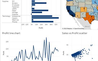
Creating an Interactive Graph with Tableau Public
By the end of this guided project, learners will have created an interactive graph that applies principles of data visualization to tell a story using basic sales data.
-
Course by
-
Self Paced
-
2 hours
-
English
Data Visualization in Tableau: Create Dashboards and Stories
Use Tableau Web Authoring to create best practice dashboards and stories from data
-
Course by
-
Self Paced
-
2 hours
-
English

Data Visualization & Storytelling in Python
Hello everyone and welcome to this new hands-on project on data visualization and storytelling in python. In this project, we will leverage 3 powerful libraries known as Seaborn, Matplotlib and Plotly to visualize data in an interactive way. This project is practical and directly applicable to many industries. You can add this project to your portfolio of projects which is essential for your next job interview.
-
Course by
-
Self Paced
-
3 hours
-
English
Create a Big Number KPI Dashboard in Tableau Public
Tableau is widely recognized as one of the premier data visualization software programs.
-
Course by
-
Self Paced
-
2 hours
-
English

Sales Reporting with HubSpot
In this course, you will use your business data and identify key metrics in order to report on sales with HubSpot’s dashboards. First, you will learn how to operate a data-driven business and how to audit, clean, and organize your data within HubSpot’s CRM. You will then learn to identify the key metrics used to analyze your data on sales and customer service success, within the stages of the Inbound Methodology. This will cover types of testing, using the Sales Hub tools, and reporting in each stage of the methodology.
-
Course by
-
Self Paced
-
English

Visualizing Data in the Tidyverse
Data visualization is a critical part of any data science project. Once data have been imported and wrangled into place, visualizing your data can help you get a handle on what’s going on in the data set. Similarly, once you’ve completed your analysis and are ready to present your findings, data visualizations are a highly effective way to communicate your results to others.
-
Course by
-
Self Paced
-
17 hours
-
English

Getting Started with Data Warehousing and BI Analytics
Kickstart your Data Warehousing and Business Intelligence (BI) Analytics journey with this self-paced course. You will learn how to design, deploy, load, manage, and query data warehouses and data marts. You will also work with BI tools to analyze data in these repositories.
-
Course by
-
Self Paced
-
17 hours
-
English
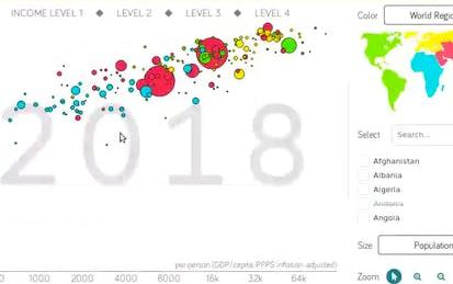
Data Visualization with Plotly Express
Welcome to this project-based course on Data Visualization with Plotly Express. In this project, you will create quick and interactive data visualizations with Plotly Express: a high-level data visualization library in Python inspired by Seaborn and ggplot2. You will explore the various features of the in-built Gapminder dataset, and produce interactive, publication-quality graphs to augment analysis. This course runs on Coursera's hands-on project platform called Rhyme. On Rhyme, you do projects in a hands-on manner in your browser.
-
Course by
-
Self Paced
-
3 hours
-
English
COVID19 Data Visualization Using Python
By the end of this project, you will learn How you can use data visualization techniques to answer to some analytical questions.
-
Course by
-
Self Paced
-
2 hours
-
English

Master the Art of Data Visualization With Tableau Public
Tableau is widely recognized as one of the premier data visualization software programs.
-
Course by
-
Self Paced
-
3 hours
-
English
Data Visualization using dplyr and ggplot2 in R
Welcome to this project-based course Data Visualization using ggplot2 and dplyr in R. In this project, you will learn how to manipulate data with the dplyr package and create beautiful plots using the ggplot2 package in R. By the end of this 2-hour long project, you will understand how to use different dplyr verbs such as the select verb, filter verb, arrange verb, mutate verb, summarize verb, and the group_by verb to manipulate the gapminder dataset.
-
Course by
-
Self Paced
-
3 hours
-
English
Data Visualization with Power BI: Storytelling with Data
Data is the new lifeblood of business and visualization has emerged as the common language.
-
Course by
-
Self Paced
-
2 hours
-
English

Fundamentals of Data Visualization
Data is everywhere. Charts, graphs, and other types of information visualizations help people to make sense of this data. This course explores the design, development, and evaluation of such information visualizations. By combining aspects of design, computer graphics, HCI, and data science, you will gain hands-on experience with creating visualizations, using exploratory tools, and architecting data narratives.
-
Course by
-
Self Paced
-
15 hours
-
English
Plots Creation using Matplotlib Python
By the end of this project, you will be able to add the data in the CSV file to Pandas data frame, plot the graph, and set marker type and color. You will also be able to apply labels, change font size, add grid lines and legends. Finally, you will be able to create the boxplot and save the graph as an image using the matplotlib and seaborn libraries, which are the most important libraries in python that are used for Data Visualization. You can create bar-plots, scatter-plots, histograms, and a lot more with them. This guided project is for people in the field of data and data analysis.
-
Course by
-
Self Paced
-
3 hours
-
English
Geospatial Data Visualization using Python and Folium
In this project, we are going to learn how to process and analyze geospatial data.
-
Course by
-
Self Paced
-
3 hours
-
English
Principal Component Analysis with NumPy
Welcome to this 2 hour long project-based course on Principal Component Analysis with NumPy and Python. In this project, you will do all the machine learning without using any of the popular machine learning libraries such as scikit-learn and statsmodels. The aim of this project and is to implement all the machinery of the various learning algorithms yourself, so you have a deeper understanding of the fundamentals.
-
Course by
-
Self Paced
-
3 hours
-
English
Visualize Financial Data In Tableau
Tableau is widely recognized as one of the premier data visualization software programs.
-
Course by
-
Self Paced
-
2 hours
-
English
Exploratory vs Confirmatory data analysis using Python
This Guided Project, Exploratory and Confirmatory Data Analysis using python, is for those who want to learn about different methods of data analysis. In this 2-hour-long project-based course, you will understand and apply Exploratory Data Analysis, build different Data visualizations, apply different exploration techniques based on the data at hand and define and understand the concept of Confirmatory Data Analysis. This project is unique because you will learn how and where to start your data exploration.
-
Course by
-
Self Paced
-
2 hours
-
English
Assessment for Data Analysis and Visualization Foundations
This course is the final step in the Data Analysis and Visualization Foundations Specialization. It contains a graded final examination that covers content from three courses: Introduction to Data Analytics, Excel Basics for Data Analysis, and Data Visualization and Dashboards with Excel and Cognos. From the Introduction to Data Analytics course, your understanding will be assessed on topics like the data ecosystem and the fundamentals of data analysis, covering tools for data gathering and data mining.
-
Course by
-
Self Paced
-
1 hour
-
English