


Generative AI for Business Leaders
Advertising with Meta
How Google does Machine Learning


Our Courses

Splunk Knowledge Manager 103
In this course, you will go beyond dashboard basics and learn about Dashboard Studio's underlying framework, the dashboard development process from prototyping and wireframing to troubleshooting as well as adding visualizations, dynamic coloring and drilldowns. Then you will go further by making your dashboards interactive with user inputs. You will learn how to use mock data, add annotation searches to a visualization, and improve dashboard performance.
-
Course by

-
 Self Paced
-
 5 hours
-
 English
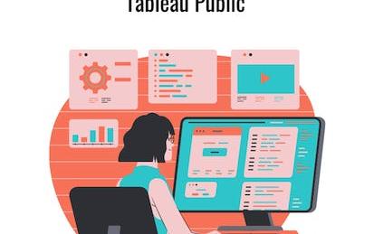
Create a Big Number KPI Dashboard in Tableau Public
Tableau is widely recognized as one of the premier data visualization software programs.
-
Course by
-
Self Paced
-
2 hours
-
English

Sales Reporting with HubSpot
In this course, you will use your business data and identify key metrics in order to report on sales with HubSpot’s dashboards. First, you will learn how to operate a data-driven business and how to audit, clean, and organize your data within HubSpot’s CRM. You will then learn to identify the key metrics used to analyze your data on sales and customer service success, within the stages of the Inbound Methodology. This will cover types of testing, using the Sales Hub tools, and reporting in each stage of the methodology.
-
Course by
-
Self Paced
-
English

How to design Facebook/IG Stories using Canva
In this 1-hour long project-based course, you will learn how to create designs for Instagram/Facebook stories using Canva. We will use the Canva platform to create social media(Instagram and Facebook) stories using built-in templates as well as from the scratch. This course includes Canva introduction, exploration of Canva dashboard, you will learn to use different elements from Canva, creation of social media stories using built-in templates, and from the scratch.
-
Course by
-
Self Paced
-
2 hours
-
English
Understanding Your Google Cloud Costs
Understanding Your Google Cloud Costs is most suitable for those working in a technology or finance role who are responsible for managing Google Cloud costs. You’ll learn how to set up a billing account, organize resources, and manage billing access permissions. In the hands-on labs, you'll learn how to view your invoice, track your Google Cloud costs with Billing reports, analyze your billing data with BigQuery or Google Sheets, and create custom billing dashboards with Looker Studio. Students enrolling in this course do not need any prior Google Cloud technical experience.
-
Course by
-
Self Paced
-
5 hours
-
English

From Excel to Power BI
Are you using Excel to manage, analyze, and visualize your data? Would you like to do more? Perhaps you've considered Power BI as an alternative, but have been intimidated by the idea of working in an advanced environment. The fact is, many of the same tools and mechanisms exist across both these Microsoft products. This means Excel users are actually uniquely positioned to transition to data modeling and visualization in Power BI! Using methods that will feel familiar, you can learn to use Power BI to make data-driven business decisions using large volumes of data.
-
Course by
-
Self Paced
-
3 hours
-
English

Getting Started with Data Warehousing and BI Analytics
Kickstart your Data Warehousing and Business Intelligence (BI) Analytics journey with this self-paced course. You will learn how to design, deploy, load, manage, and query data warehouses and data marts. You will also work with BI tools to analyze data in these repositories.
-
Course by
-
Self Paced
-
17 hours
-
English

HR Analytics- Build an HR dashboard using Power BI
In this 1 hour long project, you will build an attractive and eye-catching HR dashboard using Power BI.
-
Course by
-
Self Paced
-
2 hours
-
English
Interactive Machine Learning Dashboards using Plotly Dash
In this 2 hour long project-based course, you will learn how to create an HTML outline of a Plotly Dash dashboard.
-
Course by
-
Self Paced
-
3 hours
-
English
Design and Build a Data Warehouse for Business Intelligence Implementation
The capstone course, Design and Build a Data Warehouse for Business Intelligence Implementation, features a real-world case study that integrates your learning across all courses in the specialization.
-
Course by
-
Self Paced
-
45 hours
-
English

Create an E-book Cover Using Canva
In this 1-hour long project-based course, you will learn to create an E-book cover using Canva. We will use Canva platform to create ebook covers using different built-in templates from Canva and also from the scratch.
-
Course by
-
Self Paced
-
2 hours
-
English

Threat Investigation
If you are an associate-level cybersecurity analyst who is working in security operation centers, this course will help you understand how threat-centric SOC must prepare for analyzing new and emerging threats by implementing robust security investigation procedures • By the end of the course, you will be able to: • Understand cyber-threat hunting concepts • Describe the five hunting maturity levels (HM0–HM4) • Describe the hunting cycle four-stage loop• Describe the use of the Common Vulnerability Scoring System (CVSS) and list the CVSS v3.0 base metrics• Describe the CVSS v3.0 scoring compon
-
Course by
-
Self Paced
-
9 hours
-
English

Decisions, Decisions: Dashboards and Reports
You’re almost there! This is the third and final course in the Google Business Intelligence Certificate. In this course, you’ll apply your understanding of stakeholder needs, plan and create BI visuals, and design reporting tools, including dashboards.
-
Course by
-
Self Paced
-
27 hours
-
English
Data Studio: Qwik Start
This is a self-paced lab that takes place in the Google Cloud console. Data Studio lets you create dynamic, visually compelling reports and dashboards. Watch the short video Data Studio: Qwik Start - Qwiklabs Preview.
-
Course by
-
Self Paced
-
1 hour
-
English
Assessment for Data Analysis and Visualization Foundations
This course is the final step in the Data Analysis and Visualization Foundations Specialization. It contains a graded final examination that covers content from three courses: Introduction to Data Analytics, Excel Basics for Data Analysis, and Data Visualization and Dashboards with Excel and Cognos. From the Introduction to Data Analytics course, your understanding will be assessed on topics like the data ecosystem and the fundamentals of data analysis, covering tools for data gathering and data mining.
-
Course by
-
Self Paced
-
1 hour
-
English
Check Point Jump Start: Harmony Mobile
Harmony Mobile is the first mobile threat solution among the industry's top leading vendors to prevent the download of malicious files to mobile devices. With a staggering rise in mobile-related attacks, Check Point Harmony Mobile customers can rest assured knowing that their critical business assets remain protected from even the most sophisticated attacks targeting their workforce via mobile devices.
-
Course by
-
Self Paced
-
1 hour
-
English
Data Visualization Capstone
Data visualization is a critical skill for anyone that routinely using quantitative data in his or her work - which is to say that data visualization is a tool that almost every worker needs today. One of the critical tools for data visualization today is the R statistical programming language. Especially in conjunction with the tidyverse software packages, R has become an extremely powerful and flexible platform for making figures, tables, and reproducible reports.
-
Course by
-
Self Paced
-
22 hours
-
English
Designing Engaging Dashboards for Healthcare Analytics
Introduces processes and design principles for creating meaningful displays of information that support effective business decision-making. Studies how to collect and process data; create visualizations (both static and interactive); and use them to provide insight into a problem, situation, or opportunity. Introduces methods to critique visualizations along with ways to answer the elusive question: “What makes a visualization effective?” Discusses the challenges of making data understandable across a wide range of audiences.
-
Course by
-
Self Paced
-
16 hours
-
English

Google Ads for Beginners
In this 2-hour long tutorial, you will learn how to get started with Google Search Ads and create successful campaigns to reach new customers and grow your business. We'll work on Google Ads, Google's online advertising platform. You will drive qualified traffic, or best-fit customers to your business while they're searching on Google, for products and services like the ones that you offer.
-
Course by
-
Self Paced
-
3 hours
-
English

Building Custom Regional Reports with Google Analytics
In this 2 hours project you will learn how to build custom regional reports with Google Analytics. You will familiarize with Google Analytics and its usage, create a marketing custom regional dashboard with table and graph widgets, customize a standard geo report and scheduled the report you have designed to be sent monthly via email to a distributed regional marketing team.
-
Course by
-
Self Paced
-
3 hours
-
English
Create a Sales Dashboard using Power BI
In this 1 hour long project, you will build an attractive and eye-catching sales dashboard using Power BI in a black and blue theme that will make your audience go "wow".
-
Course by
-
Self Paced
-
2 hours
-
English

How to Schedule Posts to Multiple Platforms using Hootsuite
In this hands on guided course, you will learn about Hootsuite, a social media management platform and you will learn how we can schedule posts to different social media platforms. So by the end of this course, you will learn to use the Hootsuite platform, you will learn to publish posts across your various social media sites through one centralized location, you will explore various functionality of the Hootsuite dashboard and you will also learn how we can use Hootsuite to automate the social media posts
-
Course by
-
Self Paced
-
3 hours
-
English
Build a Machine Learning Web App with Streamlit and Python
Welcome to this hands-on project on building your first machine learning web app with the Streamlit library in Python. By the end of this project, you are going to be comfortable with using Python and Streamlit to build beautiful and interactive ML web apps with zero web development experience! We are going to load, explore, visualize and interact with data, and generate dashboards in less than 100 lines of Python code!
-
Course by
-
Self Paced
-
3 hours
-
English
Build Dashboards in Power BI
In this project, you will create a Dashboard in Power BI.
-
Course by
-
Self Paced
-
3 hours
-
English
Reports, Dashboards, and Customer Success in Salesforce
The fourth course in the Salesforce Sales Operations Professional Certificate — Reports, Dashboards, and Customer Success in Salesforce — is for anyone who is curious about entry level sales roles that require foundational skills in Salesforce, the sales operations specialist role specifically, how to use tools in Salesforce to improve customer service at a business, how to leverage data in Salesforce to improve the overall performance of a sales team, and the path to becoming a Salesforce administrator. This fourth course goes into more depth on how a sales operations specialist would use Sa
-
Course by
-
Self Paced
-
31 hours
-
English