

Our Courses

Salesforce Capstone: Organization Integration
In Salesforce Capstone: Organization Integration, the final course of the Salesforce Fundamentals Specialization, learners will complete the Business Administration Specialist Superbadge as their main project. This project asks learners to combine all the skills and knowledge areas that they have collected from the previous three courses.
-
Course by

-
 Self Paced
-
 7 hours
-
 English

Build an E-commerce Dashboard with Figma
This course runs on Coursera's hands-on project platform called Rhyme.
-
Course by

-
 Self Paced
-
 3 hours
-
 English

How to create Social Media graphics using Canva
In this 1-hour long project-based course, you will learn how to create different Social Media graphics using Canva. We will use the Canva platform to create social media graphics using built-in templates and also from the scratch. This course includes Canva introduction, exploration of Canva dashboard, you will learn to use different elements from Canva, creation of social media posts using built-in templates, and from the scratch.
-
Course by

-
 Self Paced
-
 3 hours
-
 English

Create a Project Management Dashboard using Bitrix24
In this 1 hour long, project based course you will learn how to set up a project management dashboard using the Bitrix24 free plan Note: This course works best for learners who are based in the North America region. We’re currently working on providing the same experience in other regions.
-
Course by

-
 Self Paced
-
 2 hours
-
 English

Deploy and Maintain Power BI Assets and Capstone project
This course forms part of the Microsoft Power BI Analyst Professional Certificate. This Professional Certificate consists of a series of courses that offers a good starting point for a career in data analysis using Microsoft Power BI. In this course, you’ll learn how to deploy and maintain assets in Power BI. Through hands-on exercises, you’ll explore the process of creating, implementing, and managing Power BI workspaces.You’ll also implement security and monitoring to protect data in organizations.
-
Course by

-
 Self Paced
-
 4 hours
-
 English

Create a Professional Automated Landing Page using Mailchimp
In this 1-hour long project-based course, you will learn how to design a professional landing page with a lead magnet to collect email addresses from scratch. We will then use the Email Automation feature from Mailchimp to send an automated email with an option to download the Free lead magnet and a Call to Action to join a webinar where a marketer can then sell premium products. This lead generation strategy is highly effective with really high conversion rates if done right. This guided project is beginner-friendly.
-
Course by

-
 Self Paced
-
 2 hours
-
 English

Get Started with Wrike
Wrike is a versatile and customizable project management software that enables teams to coordinate tasks, track workflows and allows for easy and dynamic communication between team members. By the end of this project, you will learn about the utility of this digital project management tool, how to set up an account on Wrike and invite users to your workspace. You will familiarize yourself with the dashboard organization, learn how to create spaces, folders and projects, as well as creating tasks within a project.
-
Course by

-
 Self Paced
-
 3 hours
-
 English

Analytics as a Service for Data Sharing Partners
This is a self-paced lab that takes place in the Google Cloud console. In this lab you will learn how Authorized Views in BigQuery can be shared and consumed to create customer-specific dashboards.
-
Course by

-
 Self Paced
-
 1 hour
-
 English

Dashboarding and Deployment
This course will take you through the various parts of analytical dashboarding: from best practices for designing a dashboard, creating a unified analytical environment, to deploying and publishing visualizations. We will briefly discuss the advanced visualization techniques and you will develop an information layout of the biggest gainers and losers in the financial markets and compare those movements to the economic data as your capstone project.
-
Course by

-
 Self Paced
-
 9 hours
-
 English

Looker Data Explorer - Qwik Start
This is a Google Cloud Self-Paced Lab. In this lab, you will create a series of visualizations from the Airports and Flights datasets and save them to a dashboard in Looker.
-
Course by

-
 Self Paced
-
 1 hour
-
 English

Microsoft Power Platform Fundamentals
In this course, you will learn the business value and product capabilities of Power Platform. You will create simple Power Apps, connect data with Microsoft Dataverse, build a Power BI Dashboard, automate a process with Power Automate, and build a chatbot with Power Virtual Agents.
-
Course by

-
 Self Paced
-
 25 hours
-
 English

Foundations of Business Intelligence
This is the first of three courses in the Google Business Intelligence Certificate, which will help develop the skills needed to apply for entry-level roles as a business intelligence (BI) professional. People who work in BI help organizations access the right data, use data to help businesses grow and improve, and put insights into action. In this course, you’ll discover the role of BI professionals within an organization and explore BI tools you can use on the job.
-
Course by

-
 Self Paced
-
 25 hours
-
 English

تحليل البيانات باستخدام Tableau
فى نهاية هذا المشروع، هتكون قادر تصمم dashboards تساعد شركتك على اتخاذ القرارات بشكل سليم باستخدام البرنامج الشهير Tableau.
-
Course by

-
 Self Paced
-
 2 hours
-
 Arabic
رسم البيانات في Power BI: قم بإنشاء أول Dashboard
بنهاية هل مشروع، رح تقدروا تصمموا وتبنوا أول Power BI Dashboard خاص فيكم .
-
Course by

-
 Self Paced
-
 4 hours
-
 Arabic

إنشاء المخططات و لوحات المعلومات باستخدام Microsoft Excel
فى نهاية المشروع هتقدر تنفذ مخططات فى Microsoft excel, عشان تحلل بيانات الاكل بتاعة Starbucks. خلال المشروع هتقدر تعمل جداول pivots عشان تساعدنا اننا نوصل للمعلومات اسهل و اسرع و تظهر المعلومات من جداول ال pivot على هيئة مخططات line, bar و pie. و هتقدر تعمل المخططات وازاى تعمل format للمخططات دى عشان يبقوا سهلين و مناسبين للعرض فى التقارير. و اخر حاجة هتقدر تستعمل جدوال ال pivots و المخططات فى ال dashboard, عشان توصل لصورة كاملة لكل التحاليل بتاعة البيانات. المشروع مخصص للأشخاص المبتدئين اللى عندهم خبرة بسيطة في Microsoft excel.
-
Course by

-
 Self Paced
-
 3 hours
-
 Arabic
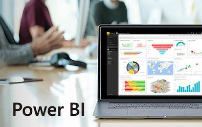
PowerBI: Preparación de datos para el análisis
La transformación y preparación de los datos es una fase clave a la hora de generar dashboards en Power BI.
-
Course by

-
 Self Paced
-
 3 hours
-
 Spanish

Daten über Visualisierungen teilen
Dies ist der sechste Kurs im Google Data Analytics Certificate. In diesen Kursen lernen Sie alles, was Sie für eine Einstiegsposition in der Datenanalyse benötigen. Sie lernen, wie Sie Ihre Datenergebnisse visualisieren und präsentieren, während Sie den Datenanalyseprozess abschließen. In diesem Kurs erfahren Sie, wie Datenvisualisierungen, wie z. B. visuelle Dashboards, dazu beitragen können, Ihre Daten zum Leben zu erwecken. Außerdem lernen Sie Tableau kennen, eine Datenvisualisierungsplattform, mit der Sie effektive Visualisierungen für Ihre Präsentationen erstellen können.
-
Course by

-
 Self Paced
-
 German

Crea tus dashboards y aplicaciones interactivas con R Shiny
En este curso basado en un proyecto y de 1 hora de duración, aprenderás a crear aplicaciones interactivas con R shiny.
-
Course by

-
 Self Paced
-
 2 hours
-
 Spanish
Curso Completo de Machine Learning en Microsoft Power BI
Este proyecto es un curso práctico y efectivo para aprender a integrar modelos de Machine Learning en tus dashboards de Power BI Desktop.
-
Course by

-
 Self Paced
-
 2 hours
-
 Spanish

Diseño y optimización de un modelo de datos en Power BI
El modelo de datos es una de las partes clave para el buen funcionamiento del dashboard de Power BI.
-
Course by

-
 Self Paced
-
 3 hours
-
 Spanish

Analíticas en Redes Sociales
En este último curso de la Especialidad “Analíticas de marketing Digital”, tendrás la oportunidad de adentrarte en el mundo de las diversas redes sociales, conociendo cómo y cuándo es recomendable utilizarlas, aprendiendo a administrar sus indicadores a través de KPIs y dashboards. Cerraremos el curso con la importancia de hacer Social Listening y el futuro de las redes sociales. Los principales objetivos que perseguimos en este curso son los siguientes: 1. Conocer las más importantes plataformas de redes sociales de la actualidad, entendiendo sus targets y principales usos. 2. Analizar los p
-
Course by

-
 Self Paced
-
 Spanish

Operaciones de ventas de Salesforce
The Salesforce economy will create more than $1 trillion in new revenue and 4.2 million jobs between 2019 and 2024. Developed in partnership with Trailhead — Salesforce's official learning platform — this certificate aims to teach you the foundational skills in Salesforce that will prepare you for a variety of entry-level sales roles, including the sales operations specialist position. This certificate is designed for beginners. No previous experience in Salesforce, sales, or CRM is necessary to be successful.
-
Course by

-
 Self Paced
-
 Spanish

Measure and Optimize Social Media Marketing Campaigns
This course provides you with the skills to optimize your social media marketing efforts. Learn to evaluate and interpret the results of your advertising campaigns. Learn how to assess advertising effectiveness through lift studies and optimize your campaigns with split testing. Understand how advertising effectiveness is measured across platforms and devices, learn how to evaluate the ROI of your marketing, and master how to communicate your social media marketing results to others in the company.
-
Course by

-
 Self Paced
-
 19 hours
-
 English

Share Data Through the Art of Visualization
This is the sixth course in the Google Data Analytics Certificate. You’ll learn how to visualize and present your data findings as you complete the data analysis process. This course will show you how data visualizations, such as visual dashboards, can help bring your data to life. You’ll also explore Tableau, a data visualization platform that will help you create effective visualizations for your presentations.
-
Course by

-
 Self Paced
-
 24 hours
-
 English

Excel Power Tools for Data Analysis
Welcome to Excel Power Tools for Data Analysis. In this four-week course, we introduce Power Query, Power Pivot and Power BI, three power tools for transforming, analysing and presenting data. Excel's ease and flexibility have long made it a tool of choice for doing data analysis, but it does have some inherent limitations: for one, truly "big" data simply does not fit in a spreadsheet and for another, the process of importing and cleaning data can be a repetitive, time-consuming and error-prone.
-
Course by

-
 15 hours
-
 English


